Quinnipiac University in Hamden, Connecticut, is represented by over 20 varsity teams sharing the same logo and the name Quinnipiac Bobcats.
Meaning and history
The Quinnipiac Bobcats, a symbol of athletic prowess at Quinnipiac University, originated in Hamden, Connecticut, intertwined with the university’s establishment in 1929. This athletic chapter has carved its niche in NCAA Division I, gaining recognition through consistent athletic excellence. Central to their accolades is the women’s ice hockey team, which has emerged as a powerhouse, frequently gracing national tournaments with their skill and determination. On the hardwood, the men’s basketball squad has consistently been a formidable contender within their conference, showcasing talent and teamwork. Currently, the Quinnipiac Bobcats uphold their legacy, continually strengthening their position in the collegiate athletic landscape, embodying the spirit of competition and integrity across various sports.
What is Quinnipiac Bobcats?
Quinnipiac Bobcats is the name of the athletic program from the Quinnipiac University, located in Connecticut, USA. The program consists of 21 men’s and women’s teams in various sports disciplines, including Basketball, Ice Hockey, Golf, Soccer, and many more, with the Basketball team as the most famous.
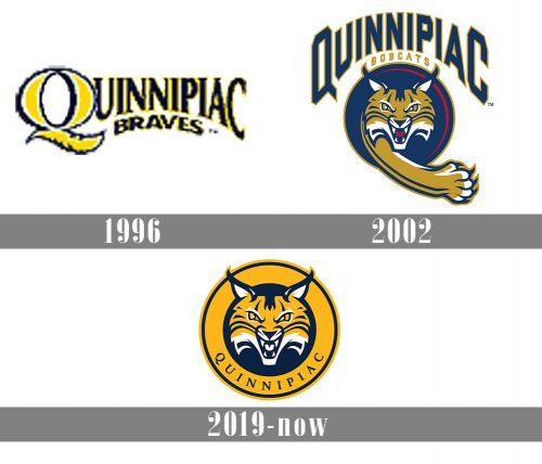
1996

As the club was established under the name Quinnipiac Braves, the first logo for them was designed without any graphical image of a cat. It was a simple yet bright and eye-catching emblem, composed of two text lines, with the upper one, “Quinnipiac”, enlarged and having its “Q” emboldened and brightened up, and the bottom “Braves” arched under it in all capitals. The yellow and blue color palette of the emblem represented the energy and power of the club.
2002

The redesign of 2002 happened right after the name change of the club to Quinnipiac Bobcats. This is when the first animalistic motif appeared on the club’s badge. The new logo was composed of a stylized dark and calm blue uppercase lettering arched above the circular graphical emblem. The lettering was executed in a custom geometric sans-serif typeface with its first and last letters enlarged. As for the color palette. The main color of the letters was blue, and the contours — dark gold. The rounded graphical part of the Bobcats logo featured a dark blue background with a thin smooth gold line on the right. In the middle of the medallion, there was a dark gold, white and blue image of a wild cat, which represented the danger, determination, and strength of the team.
2019 – Today
Both the 2019 Quinnipiac Bobcats logo and the previous one feature a cat’s head. The current version is slightly more minimalistic. Here, there is only the head inside a yellow ring housing the word “Quinnipiac.” On the previous logo, there was also the cat’s paw stretched out forward. The lettering was larger, more pronounced.
Quinnipiac Bobcats Colors
NAVY
PANTONE: PMS 289 C
HEX COLOR: #0C2340;
RGB: (12, 35, 64)
CMYK: (100, 76, 12, 70)
GOLD
PANTONE: PMS 1235 C
HEX COLOR: #FFB81C;
RGB: (255, 184, 28)
CMYK: (0, 31, 98, 0)
LIGHT BLUE
PANTONE: PMS 279 C
HEX COLOR: #418FDE;
RGB: (65, 143, 222)
CMYK: (68, 34, 0, 0)


