Paytm Logo PNG
Paytm is the name of an online payment service, created in 2010 in India. Today the service is used by millions of people in the Asian region and is available in more than 10 dialects, which makes it easier to use it for such a large multinational country. Apart from online payment, Paytm also provides its users with such services as online shopping, digital wallet, and mobile payments.
Meaning and history

Paytm is India’s digital mobile payment platform, created by Vijay Shekhar Sharma in 2010. The name of the service stands for “Payment via Mobile”, which perfectly reflects the essence and purpose of the platform. The company originally started as a mobile recharge site under the wingof One97 Communications. Later, in 2013, the company added many new services such as data cards, pay-as-you-go mobile, and landline bills.
In 2014 Paytm entered the e-commerce field, offering features like Flipkart, Snapdeal, and Amazon. Now it’s a multi-billion dollar company that handles a variety of services such as mobile and DTH recharges, movie tickets, bus, air, and train reservations, and the infamous Paytm wallet.
Paytm’s registered user base soon grew, and in 2017 Paytm became India’s first payment app to exceed 100 million app downloads.
What is Paytm?
Paytm is the name of an Indian online-payment system, which was launched in 2010. The service lets users transfer money from their bank account to a digital wallet, allowing them to make payments without a credit or debit card. You can use it to pay your data card, and utility bills, and top up your cell phone account.
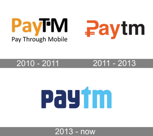
2010 – 2011

The very first logo for PayTM was introduced in 2010 and only stayed with the brand for more than a year. It was a simple yet bright and confident logotype with the “Pay” part written in the title case and using the orange color, and the “TM” in black capitals, executed in a wide and bold sans-serif typeface and having a solid square with rounded angles separating the two letters in the upper part of the inscription.
2011 – 2013

The 2011 logotype is similar in design to the previous one, in that it’s a wordmark divided into an orange and a black parts. It looks different, as they’ve mostly made these letters a simple sans-serif font made in all lowercase (besides the very first letter, which is a whole other element).
The first letter is a regular capitalized character, which resembles rather a question mark with two horizontal lines in the bottom (like in the rupee’s symbol, ₹). The orange in this design is also darker.
2013 – Today
Since the Indian company was only created in 2010, its visual identity hasn’t changed much since the day of the first logo introductions the Paytm emblem is composed of two parts, which are sometimes used together, but mostly — on their own.
The logo of Paytm featured a bold stylized inscription in a custom sans-serif typeface, with all the letters set in the lowercase. The inscription is visually divided into two parts, due to the use of two different shades of blue — a dark one for the “Pay” and a light, sky-blue for “Tm”. This combination of colors evokes a sense of safety and reliability and shows the professionalism of the company, which aims to provide its audience with high-quality and protected services so that the customers could feel safe and confident about their finances.
The graphical part of the Paytm logo is executed in the same blue color palette, but with the light shade prevailing. It is the image of a wallet, which reflects the purpose and essence of the application and adds some friendliness to a simple and modest wordmark. The emblem is usually used by the company as its web and mobile app icon, but sometimes is placed above the logotype, in its right part.
The Paytm visual identity is pretty simple, but due to the interesting lines of its inscription and a calm and pleasant color palette, the strict logo turns into something welcoming and trustworthy, making people want to use it, staying confident.
Font and Color
The extra-bold lowercase logotype from the primary badge of the PayTM online service is set in a heavy sans-serif typeface, which was designed exclusively for the brand. There is some resemblance to the Mike Sans Heavy font, but with the contours of most letters modified.
As for the color palette of the Paytm visual s identity, it uses two shades of blue — dark one as a symbol of professionalism, protection, and stability, and sky-blue as a fresh accent and a representation of the trustworthiness and reliability of the service.


