The PapaJohns.com Bowl was played in 2006–2010. It was a post-season NCAA-sanctioned Division I FBS college football bowl game that took place every year. Today, the game is known as the Birmingham Bowl.
Meaning and history
Initiated in 2006 by ESPN Regional Television, the PapaJohns.com Bowl emerged as a new beacon in the collegiate football universe. This postseason event was more than just a game; it was a celebration of football, providing a prestigious platform for collegiate teams to demonstrate their prowess beyond the regular season. The bowl’s notable achievements lie in its ability to consistently bring together formidable teams, primarily from the SEC and Big East Conferences. This convergence has led to some of the most electrifying and memorable moments in college football history. In its journey, the PapaJohns.com Bowl has experienced various transformations in sponsorship and branding, each phase reflecting its adaptive and dynamic nature in the ever-evolving sports landscape. Today, the bowl continues to be a cornerstone in the college football season, epitomizing the spirit of competition and the pursuit of excellence in collegiate sports.
What is PapaJohns.com Bowl?
Contrary to a corporate entity, the PapaJohns.com Bowl is a celebrated postseason college football event. Inaugurated in 2006 with Papa John’s as its initial sponsor, this bowl game has become a pivotal part of the college football season. It is renowned for hosting teams mainly from the SEC and Big East, offering a stage for spirited competition and showcasing emerging talents in the sport. The bowl is a testament to the enduring allure and competitive nature of collegiate football.
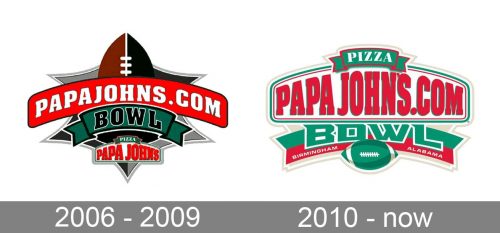
2006 – 2009
The highlight of the original PapaJohns.com Bowl logo was the name of the sponsor. The text “PapaJohns.com” looked very bright over the red arched board used as the background. Below it, the word “Bowl” in capitals over a green banner could be seen. On top of the logo, one of the sharp ends of a football was placed.
2010 – Today
The newer emblem (2010) was dominated by lighter colors. While the text was the same, the set of typefaces was completely different.


