PagSeguro is the name of a Brazilian fintech company, which was established in 2006, and is considered to be one of the most successful startups of Latin America. The financial services provider is specialized in online payment solutions and electronic payment systems.
Meaning and history
PagSeguro was founded in Brazil in order to create a strong competitor to PayPal on the Latin American market. And it didn’t take the company kuch time to achieve its first impressive results. Today PagSegiro is a very reputable brand, known not only in Brazil, but all over the globe.
PagSeguro is a full-fledged fintech ecosystem. Through its platform, merchants make online payments, sell goods and services, and PagSeguro also provides digital banking services to both individual users and legal entities.
PagSeguro is a Brazilian fintech. It is a comprehensive digital banking ecosystem that allows merchants to accept payments and manage their businesses. PagSeguro is a part of Universo Online, which is Brazil’s largest online portal, with more than 50 million unique visitors.
The main secret to PagSeguro’s success and the driving factor for its growth is that almost a quarter of the Brazilian population is entrepreneurial. This figure is significantly higher than in other countries. Small businesses are the main audience of PagSeguro.
What is PagSeguro?
PagSeguro is an online payment platform, which was established in Brazil in 2006. Today the company operates globally, providing customers from all over the world with its financial services and online payment technologies.
In terms of visual identity, PagSeguro is pretty simple and laconic, with its badge executed in a calm yet memorable color palette, and the lettering set in a heavy italicized font, which evokes a sense of movement and progress.
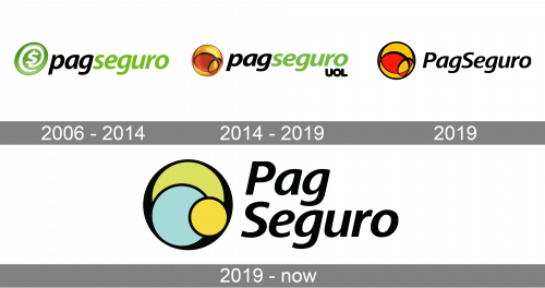
2006 – 2014
The original PagSeguro logo, designed for the company in 2006, has stayed with the financial service provider for almost six years. It was a composition with the gradient green emblem featuring a stylized @ sign with a USD symbol in the center, drawn on the by left from a lowercase italicized lettering in black and green. The logo was underlined by the “Uma Empresa UOL” tagline, which means “The Company of UOL” (UOL — Universo Online).
2014 – 2019
The redesign of 2012 has refined the graphical part of the PagSeguro visual identity, changing its design to a more abstract geometric one, and its color palette to orange and red; with a glossy surface, making the image three-dimensional. As for the lettering, it remained untouched, just got a bit smaller, and the tagline was shortened to just a heavy black “UOL” abbreviation, placed in the bottom right corner of the badge.
2019
Another redesign was made to the PagSeguro visual identity in 2019. The first version of the badge, designed in May, depicted a simplified two-dimensional version of the previous emblem, in plain orange and red color palette, and with the lettering refined. The new wordmark was set in black, with the “P” and “S” capitalized. The tagline was removed.
2019 – now
However, in September the color palette of the PagSeguro emblem was switched to a muted green and yellow, while all other elements of the logo remained untouched.
Font and color
The bold yet smooth and sophisticated lettering from the primary PagSeguro badge is set in a modern slanted sans-serif typeface, with the title case characters looking stable and elegant. The closest fonts to the one, used in this insignia, are, probably, Frutiger Next Central European Bold Italic or Cast Bold Italic.
As for the color palette of the PagSeguro visual identity, it is based on the combination of smooth shades of green and yellow, with black accents and characters. The shades create a fresh and calm image, evoking a sense of reliability and trustworthiness, and reflecting the company’s responsibility and professionalism.


