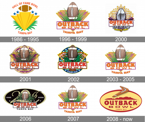
The current Outback Bowl logo was introduced in 2008. While the majority of the space here is occupied by the name of the game, it is the boomerang above it that actually catches the eye. The boomerang brings about some motion making the logo very dynamic.
Meaning and history
The inception of the Outback Bowl, a notable fixture in college football, dates back to 1986, originally christened as the Hall of Fame Bowl. This endeavor was part of a revitalization effort for a defunct bowl game previously hosted in Birmingham, Alabama. In 1995, a significant rebranding occurred when Outback Steakhouse, a well-known restaurant chain, acquired the title sponsorship, leading to the current name, Outback Bowl. This event marks a key annual encounter between teams from the Southeastern Conference (SEC) and the Big Ten Conference, cementing its status in the realm of collegiate sports.
Throughout its evolution, the Outback Bowl has carved out a reputation for attracting large, enthusiastic audiences and securing substantial television viewership. Its impact extends beyond the field, significantly benefiting Tampa Bay’s economy where the game is held each year. The scheduling of this event on New Year’s Day further elevates its prominence and allure among college football enthusiasts. Presently, the Outback Bowl stands as a significant and enduring component of the college football postseason, celebrated for its rich heritage and ongoing contribution to the dynamics of the sport.
What is Outback Bowl?
Outback Bowl is the intercollegiate American football bowl game, which is held annually since 1987 in Tampa, Florida. The bowl has its games played on the Raymond James Stadium with a seating capacity of 70 thousand.
1986 – 1995
The very first logo for the Bowl was designed in 1986 and featured a solid bright design with many colorful elements. The largest element of the badge was a triangular crest, pointing down. The crest was decorated with four solid blue five-pointed stars on top, and green palm leaves coming out of its bottom part. Above the yellow triangle there was a brown rugby ball, set horizontally, and “covered” with the arched red “Hall of Fame Bowl” lettering in a simple sans-serif font. The same style of the lettering was applied to the “Tampa Bay”, arched under the yellow crest.
1996 – 1999
The Outback Bowl logo from 1996 featured a cool tropic design of a badge with the vertically located rugby ball decorated with green grass set on a bright gradient orange and purple triangular badge, pointing down. The intense orange inscription in two lines was set on a white background and enclosed into a purple rectangular frame on the bottom of the logo. The whole composition was underlined by the arched “Tampa Bay” inscription in bold orange capitals of a simple sans-serif typeface.
2000
For the “Millennium” game the new logo was designed for the Bowl. The gradient metallic “2000” was added under the white rectangular banner, and the rugby was redrawn with the same metallic effect. The grass on the background was replaced by yellow rays with small stars on the ends, and the colorful triangles — by the sleek purple rhombus. The arched “Tampa Bay” inscription was set at the bottom of the logo and executed in bright yellow.
2001
The coconut-rugby badge was slightly refined in 2001. All the elements from the original version, apart from “Tampa Bay” lettering at the bottom, remained in their own places, but now the badge was set inside the rounded frame in a light shade of yellow. The purple lettering was placed on the frame, “Tampa Bay” on top and “15th Anniversary” along its bottom part. The anniversary logo looked balanced and very eye-catching, brilliantly reflecting the tropical mood and happiness, and evoking only kind feelings, including friendliness and energy.
2002
With the redesign of 2002, the color palette of the iconic Outback Bowl logo was switched to a patriotic blue-red, and white one. The triangular crest now featured a striped red and white pattern, while the circular frame of the logo was set in solid blue and was decorated by solid white five-pointed stars. The main background of the logo was set in light blue, and the “Outback Bowl” logotype changed its color from orange to red. The “Tampa Bay” inscription was now set in a serif typeface, with its uppercase bold letters in white written along the bottom part of the blue frame.
2003 – 2005
The last version in the “coconut-rugby” era was introduced in 2003 and stayed in use by the Bowl until 2007. The contours were modernized, cleaned, and emboldened, the circular frame and background were removed, and the color palette got switched to a lighter and more tender one. Really, the logo was fully based on the original version, but with lines more even and smooth, and the contrast of the colors a bit muted, which elevated the look of the badge, making it more confident and professional.
2006
For the 20th anniversary of the Bowl, the logo was redrawn in a very bold and fancy style. All elements of the visual identity were set on a horizontally stretched oval with a solid black background and a wide golden frame. The vertically located rugby was inscribed into a zero in the stylized “20th”, written in the same shade of gold, and having elongated curved lines. The white rectangular banner with the bold red “Outback Bowl” was set at the bottom of the logo and underlined by a black capitalized “Tampa Bay” lettering in a strict and straight sans-serif typeface.
2007
In 2007 the logo was redesigned in a bright and delightful color palette, repeating the composition of the badge, created in 2003, but with lighter and more intense shades of both graphical elements and lettering. The bright orange of the inscription was balanced by the orange of two out of three triangles, forming the background of the rugby ball.
2008 – 2020
A completely new design concept was created for the Outback Bowl in 2008. No more tropical images on the badge. The new logo featured a horizontally oriented ellipsoid, colored calm yellow and outlined in dark red. The upper part of the logo had a very realistic and detailed image of a wooden boomerang with white details on it. As for the main part of the crest, it Bosted a bold sans-serif inscription in dark red, set under the minimalist image of the mountain landscape. The lightweight uppercase “Tampa Bay” was written under the logotype in a clean and delicate sans-serif typeface.
2021 – Today
For the 35th anniversary of the Outback Bowl, the logo was slightly refined in 2021. The red frame was replaced by a thicker one, executed in gradient gray. The boomerang got slightly smaller and featured its surface simpler and cleaner. The burgundy “Tampa Bay” inscription from the bottom of the logo was replaced by a bold black “1986 — 2021” datemark, and the enlarged “35th” in cursive was set on the left from the boomerang, executed in the same shade of red as the main logotype of the insignia.


