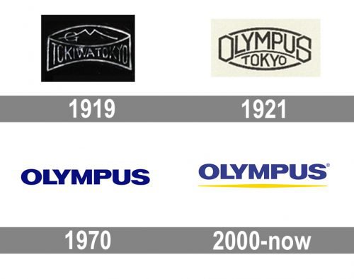
Olympus was established as Tokiwa, so the first wordmark read “Tokiwa Tokyo”. The earliest Olympus logo was introduced in February 1921. The wordmark featured a unique, rather intricate, typeface. In 1970 it was replaced by a simple dark blue typographic insignia. In 2001 a yellow line appeared under the wordmark, which was supposed to represent the company’s innovative nature.
Meaning and history
The history of the Olympus visual identity has not been very bright or full of logo variants, as the Japanese brand has been very consistent with its designs and only had two major redesigns throughout its existence. Though the logo, created after the company’s name change in 1921, was fully based on the original version, and the emblem we all can see today was just a slight modification of the 1970s insignia.
1919 — 1921
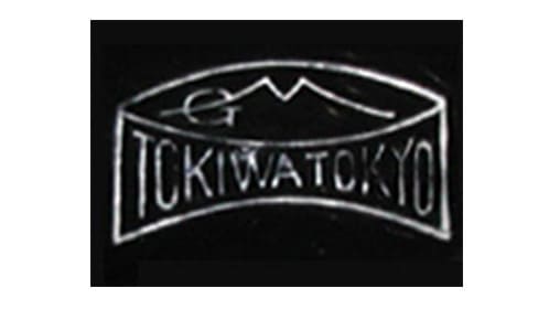
The original name of the company, established in 1919, was Tokiwa, and the logo is used for two years was based on this name and the initials of the brand’s owner. The badge was composed of a banner with the “Tokiwa Tokyo” lettering and two stylized letters “G” and “M” (for Goro Matsukato) placed above it and covered by an arched line. The thin lines of the emblem were executed in silver and placed on a black background, looking powerful and elegant.
1921 — 1970
The Olympus brand was introduced in 1921 along with the new logo. It was a sophisticated art-deco styled badge, based in the previous version, where the “Olympus” lettering in all capitals was arched above the “Tokyo” inscription. The “O” and “S” in “Olympus” were enlarged and had their contours geometric, repeating the shape of a hexagon. This time the color palette was reversed and dark gray lines were placed on a light background.
1970 — 2000
The redesign of 1970 brought a new minimalist image to the Olympus visual identity. The new logo was composed of a single capitalized wordmark in dark blue, where the solid letters were written in a bold sans-serif typeface, very similar to such fonts as Venusian Ultra NF and Molde Expanded Bold.
2000 — Today
In 2000 a bold yellow underline was added to the logotype and its main blue shade was switched to a lighter one. The underline has its ends narrowed which makes it look like a ray of light and evoke a sense of happiness and energy.


