The Oversea-Chinese Banking Corporation Limited is a banking and financial services corporation with assets of more than S$521.3 billion, which makes it the second-largest financial services group in Southeast Asia by assets (according to the corporate website). Global Finance Magazine often includes it in the top 5 safest banks in the world.
Meaning and history
The message conveyed by the OCBC Bank logo isn’t straightforward and can be interpreted in various ways.
What is OCBC Bank
OCBC Bank is among the largest and oldest banks in Singapore. Its main markets are Singapore, Malaysia, Indonesia, and Greater China. The company has 470 branches and offices in 19 countries and regions.
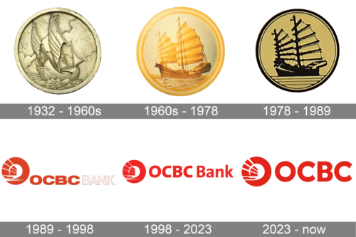
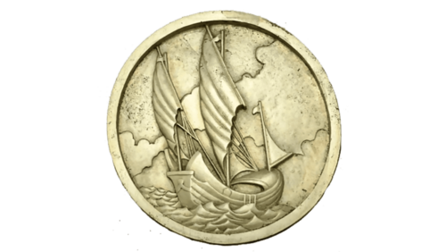
1932 – 1960s
The company named Oversea-Chinese Bank was established in 1919, but OCBC Bank starts counting its official history only from 1932. It was then that Oversea-Chinese Banking Corporation was formed as the result of the merger of three smaller companies. In addition to Oversea-Chinese Bank, the list included Chinese Commercial Bank (1912) and Ho Hong Bank (1917). Over the following decades, the company gradually attained the status of the biggest bank in South East Asia.
As a result of World War II and its aftermath, the company had to close briefly its branches at various locations, but it eventually returned to normal work and reopened its branches. By 1970, OCBC’s total assets reached 1 billion SGD. Two years later, the company purchased Four Seas Communications Bank, which at the time was the oldest working Chinese bank in Singapore.
During these difficult yet commercially successful years, the company mostly used the emblem featuring a Chinese junk. This vessel had a strong Asian heritage. In the logo, it was depicted rather realistically, with all the sails and masts, and even with the sea below. The flags and the position of the vessel, as well as the turbulent sea waves, show us that the junk has to face the wind and still successfully sails forward – something that, in the language of symbols, describes the history of the company.
We should mention, though, that there existed more than one version of this logo, and in some of them, the waters were still and other details were different.
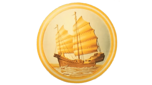
1960s – 1978
The round emblem featuring a ship was brought to life in the 60s. The most prominent color in the emblem was golden. It was used for the sails as well as a double framing. The golden accents in the ship itself and the waves gave an illusion of a sunset or a sunrise. Considering the important of ship transportation at the time as well as the word “Oversea” in the name, it was a perfect symbol for the company.
1978 – 1989
The emblem now had a beige and black color palette Although the shape of the ship and the emblem in general stayed unchanged, it looked very different. A rather romantic and adventurous image was replaced by a more serious and solid brand image. In addition, this logo had a more vintage look, reflecting the fact that the company has existed for more than several decades and can be trusted.
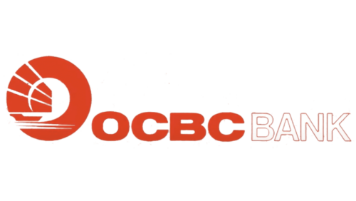
1989 – 1998
Although this logo is more recognizable, it has completely nothing in common with what the bank had earlier. The company introduced a bold, powerful red color that popped against the white background. OCBC was printed using a bold, sans-serif font of red color. The Bank portion of the name had white characters with a thin red outline. Both words had minimal spacing between the characters, which enhanced a solid brand image. The inscription was accompanied by a relatively large ring emblem with several rays extending into the center of the emblem.
1998 – 2023
In the spring of 1998, OCBC was renamed OCBC Bank and introduced a new logo. While the visual brand identity has gone through some tweaks since then, it has remained pretty loyal to its heritage.
The OCBC Bank logo now consisted of a roundel, which was in its left-hand part, and the wordmark, which was placed on the right.
The roundel housed a rather complex symbol, which looked like a source of light partly blocked by something and still throwing off occasional rays.
Someone familiar with the previous version could interpret it as the sun and a stylized Chinese junk in the sea. However, for a layperson, many other interpretations were possible. In any case, though, the core message remained the same – the promise of new, great possibilities (the bright sun) and the role of the company as a guide (a ship) that can help you get closer to your aim.
2023 – Today
Not only has the red color gotten more saturated, but the rays in the round emblem also got more prominent. The company removed the word “Bank” from the logo and replaced the font. It looked very similar to the one used in the previous version, but the “C” now had a diagonal cut instead of straight. The font used in this version is closer to Cocogoose Classic Extra Bold.
Colors and font
Bright red is a sure shot. Multiple surveys have shown that it attracts attention and can even cause positive physiological reactions. That’s why it is often used by businesses around the world in their brand identities. On the downside, it’s quite a generic color, and it’s not that easy to make a memorable logo that will stand out among competitors.
The type in the OCBC Bank logo is also a safe choice. It is a highly legible sans with classic proportions. The shape is simple and unpretentious. However, thanks to the unique emblem, this logo looks instantly recognizable.


