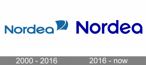
While even the old logo of the Nordea Bank was not cluttered, the current version is an example of a minimalist design.
Meaning and history
Established in 2000 as a result of a merger of four Scandinavian Banks, Nordbanken, Merita Bank, Unibank, and Christiania Bank, today Nordea Bank ABP is the leading banking group in Scandinavia and one of the largest European banking groups. The group serves about 9.3 million retail customers, more than 500 thousand small and medium-sized enterprises, as well as about 2,7 thousand large corporate clients.
Nordea Bank specializes in servicing and lending to large corporate clients. The Bank is active in the domestic interbank lending market. The main source of funding is interbank resources of the parent structure, as well as funds of corporate clients and own capital.
What is Nordea?
Nordea is the name of a financial organization, which was established in Finland in 1820 as Sparekassen for Kjobenhavn Og Omegn. Today the bank operates in all Scandinavian countries, providing its 10 million clients with a full range of banking services, including corporate and retail banking, and asset management.
2000 – 2016
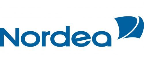
The original Nordea logo, which was developed by Landor Associates, featured the company name paired with the emblem. The emblem depicted a stylized sail. While the symbol added some dynamism, the sail does not seem an excellent choice for a bank as the sea is often connected with uncertainty. Also, it was not obvious at first glance what the emblem represented.
While the name of the brand looked stylish due to its streamline typography, we cannot say it somehow conjured up any ideas beneficial for a bank. It had a nautical feel and would have made a great logo for a swimwear brand.
2016 – Today
The designers have muted the “nautical” theme by removing the sail altogether. Instead, they have added a pulsating graphic, which is supposed to symbolize “a bank with a human and financial pulse.” Unlike the previous symbol, though, it is not usually used in the bank’s primary logo but only as an optional part.
Font
The type has remained the same in its essence but the proportions have been modified – they have been straightened up into a more average geometric shape.
Colors
The shade of blue featured in the Nordea logo has the following index in the Pantone Color Matching System: PMS C: Dark Blue C (+V2) and PMS U: 286 U (according to the brand’s official website). The hex code is #0000a0. A black-and-white version is also appropriate.
Company overview
Nordea Bank Abp is a financial services group. While it was officially established in 2000, its roots can be traced back to 1848, when its predecessor, Christiania Bank, was founded.
Nordea is headquartered in Helsinki, Finland, and works throughout northern Europe. Over its long history, it has merged with and acquired almost ten banks. As of 2020, the bank has more than 1,400 branches and operates in twenty countries. The number of private customers reaches 11 million, while the number of corporate customers reaches 700,000.


