Ninemsn is a former name of the Australian news portal, which was established in 1997 and today is known as Nine.com.au. Started from just one website, the service has grown into a network, consisting of several sites dedicated to different topics, and forming Nine Entertainment Co, which has Microsoft as a stack holder.
Meaning and history
Formed as a joined venture between Microsoft and PBL Media, Ninemsn has the direct link to its founders in the name. The “Msn” part stands for the Microsoft service, established only two years earlier, in 1995. As for the new name of the portal, it appeared only in 2016, so for most let of its history, the website had its logos based on the original name.
1997 – 1999
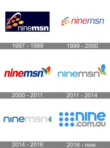
The very first Ninemsn logo was introduced in 1997, with the launch of the portal. The logo was composed of a lowercase wordmark in white, placed on a dark purple background, and accompanied by a bright emblem on the left. The emblem depicted nine solid dots in different shades of orange and a white orbit around them.
1999 – 2000
The initial logo was redrawn in 1999, but this version didn’t stay with the company for long. It was the same composition but placed on a white background and with the wring refined. The new identity looked modest yet professional and nears
2000 – 2011
The redesign of 2000 brought a new emblem, which showed the strong connection between Ninemsn ti Microsoft. It was an italicized inscription, still written in the lowercase, but with the first part of the name in red, and the second — in blue. In the right from the wordmark, there was a recognizable Msn emblem — an elegant multicolor butterfly, set above the letter “N”.
2011 – 2014
In 2011 the concept of the logo was kept, but the execution changed. The color palette of the Ninemsn visual identity was switched to light blue and gray, with the Microsoft butterfly in its iconic four-color scheme. The typeface was also replaced by a more modern one, and now the lowercase letters were wider and had more space between them.
2014 – 2016
The last logo for the original name of the portal, Ninemsn, was introduced in 2024 and was fully based on its previous version. Though there were a few significant changes. First of all, the butterfly in the right of the wordmark was made smaller, letting the inscription become a star of the logo. As for the wordmark itself, the color palette was switched to a more intense and calm one, and the dot above the letter “I” was removed, which gave a more contemporary look to the whole image.
2016 – Today
In 2016 Ninemsn is being renamed to Nine.Com.Au, and the new visual identity sees the light. The color palette of the refreshed logo is still based on blue and gray, but it’s more vivid and bright shades. As for the graphical part of the logo, the nine dots from the original version are back, but now in light blue and placed in straight lines on the left from the inscription, forming a square.


