Launched in 2020, Wholesome is an Australian online retailer that offers a wide range of products, including foods and drinks, personal care, and household goods. The very name of the company means that the products here are offered at almost wholesome prices. Apart from this, Wholesome positions itself as an “eco-health brand”, betting on healthy nutrition, sustainable packaging, and responsible sourcing. Unveiling its new identity, recently created by the Sydney-based design studio Universal Favorite, the online store wants to demonstrate the innovative methods of its direct-to-customer offerings as well as the positive vibes from the variety of branded products it sells.

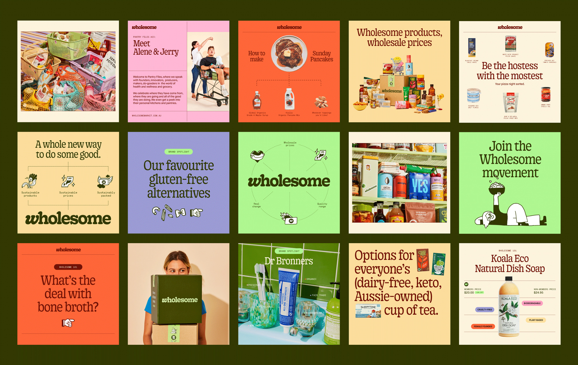
According to the studio, the company’s notion of “eco-health” was taken as a base to build a brand language that reflects Wholesome’s combination of health and sustainability. The visual system called The Wholesome Movement revolves around the idea of customers buying better, eco-friendly products to make this world better together. This idea is perceived across all the touchpoints of the Wholesome identity, including the store’s new logo.
The wordmark is designed in the Gooper serif typeface, which is an advanced version of the 1919 Cooper font with a goopy-inspired, cheerful vibe. To make the logo more distinctive, the design team slightly customized the initial “w” that seems to tuck under the ascender of the “h”. Besides, the letter can be used as a separate symbol, as Universal Favorite says.

The new design can surely elevate the image of Wholesome, especially if we compare it to the company’s old logo, which looked quite amateurish and was suited more for an ordinary grocery store than a modern online DTC retailer. The playful forms of the new typography are as practical as they are expressive. While Wholesome’s Goopy is intended to be used mainly for headlines, the brand’s typographical assets also include the sans Maison Neue, which will appear as an additional font fitted for body texts and pops. Furthermore, the type system is supplemented with Kale Sans Mono, resembling a typewriter type.

The brand’s color palette is naturally dominated by greenish shades, given the sustainable direction of Wholesome. While the logo is designed in Pale Light Green which is applied as the main brand color to the store’s website and other assets, Dark Olive is another noticeable color in the gamma. The identity is also supported by a nice range of secondary light hues.

Essentially, the new Wholesome identity, according to the project’s summary, is built on three cornerstones: curation, distillation, and organization. In this regard, curation is a figurative expression of grocery catalogs introducing products to customers. Distillation means Wholesome’s approach to product selection, which inspired the designers to use some visuals like presentational diagrams. And the organization element, which took an idea from shelves and pantries, is represented by a grid system and lines visualizing the working principles of the brand.


