The Wilmington-based freight shipping company R+L Carriers became the official sponsor of the New Orleans Bowl in 2006. Ever since the bowl game logo has been heavily influenced by the brand identity of R+L Carriers.
Meaning and history
The New Orleans Bowl, a collegiate football celebration, was initiated in 2001 under the auspices of the Greater New Orleans Sports Foundation. Hosted in the iconic Mercedes-Benz Superdome, located in the heart of New Orleans, Louisiana, this annual event has become a symbol of sporting exuberance in the college football arena. It usually features teams from the Sun Belt Conference and Conference USA, providing a unique blend of athletic competition.
The bowl’s significant achievements include its role in enhancing the visibility and appeal of college football in the New Orleans region. It has served as a vibrant stage for showcasing emerging football talents and delivering matchups that are both unexpected and exhilarating. Over the years, it has transcended beyond a mere football game; it embodies a festival that melds sports, music, and the distinctive cultural ethos of New Orleans.
Currently, the New Orleans Bowl maintains a prominent place in the collegiate football schedule. It’s not just a sports event but a cultural phenomenon that brings economic vitality to the region. Its consistent success underscores the enduring allure and importance of this annual football fiesta in New Orleans.
What is New Orleans Bowl?
New Orleans Bowl is an intercollegiate football bowl game, which was first played in 2001, and since then has been held annually at the Caesars Superdome stadium in New Orleans, Louisiana. The Bowl is affiliated with the National Collegiate Athletic Association.
2001

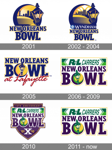
The original New Orleans Bowl logo was introduced in 2001 and featured a very stylish and modern emblem with the night city landscape and an enlarged street light enclosed into a circular frame in purple-blue. The text part of the logo was placed on the bottom part of the emblem, overlapping it. The inscription was set in all capitals of a bold square serif font, with the upper level in a smaller size. All letters featured dark blue shades and were outlined in yellow.
2002 – 2004

The New Orleans Bowl logo, designed in 2002, featured a refined version of the previous badge, accompanied by the sponsor’s logotype set above the main lettering. The white uppercase “Wyndham” was placed on the left from its corporate emblem in light blue and white, between the “New Orleans” in dark blue and yellow and a night city landscape image in the same palette.
2005

The redesign of 2005 made the lettering larger and placed the circular emblem in it, replacing the letter “O” in “Bowl”. The main color palette remained untouched but got complimented by dark red, the color of the new tagline, “at Lafayette”, handwritten in elegant cursive under the main part, slightly overlapping some of the bold blue sans-serif letters in a yellow outline. The circular emblem was simplified and the landscape was gone, now it was a solid yellow badge outlined in blue and with an enlarged street light drawn in blue lines on it.
2006 – 2009

The red cursive inscription was gone in 2006, and this is also when the purple and yellow logotype with a street tight emblem in it was placed on a rectangular white badge, is outlined in green, and with the green “RL Carriers” logotype stretched along the top border. The street light on the letter “O” changed its color palette to yellow and green, balancing the fresh additional elements of the badge.
2010

For the 10th anniversary of the Howl, the logo was refreshed. Although the previous badge was left in its original state, it was placed over a smooth and glossy crest in purple, which was outlined in yellow and purple. The datemark was set in white and yellow on the bottom part of the crest, while the “10th Anniversary” lettering was set on the top line of the logo, written in all capitals of a simple yet modern sans-serif typeface, in thin yellow lines.
2011 – Today

The 201 New Orleans Bowl logo, you can see the name of the freight shipping company given in italicized green letters. Below, there are the words “New Orleans Bowl” in larger purplish letters. The “O” glyph in the word “Bowl” houses an elegant street lamp combining at least two shades of yellow with two shades of green.


