When the film production company DreamHouse became the sponsor of the New Mexico Bowl in 2019, the logo of the bowl game went through a complete overhaul. It has borrowed a couple of elements from the previous emblems, though.
Meaning and history
The New Mexico Bowl, inaugurated in 2006, stands as a testament to the vibrant college football scene. Conceived in Albuquerque, New Mexico, this annual post-season event has become a cornerstone for teams mainly from the Mountain West and Conference USA. Its inception marked a new era in the collegiate sports landscape of the region, offering a new stage for emerging football talents.
Central to its achievements, the New Mexico Bowl has been pivotal in shaping a unique football culture. It’s not just a game; it’s a celebration that brings together communities, fans, and athletes in a festival of sportsmanship. The bowl has a notable history of showcasing players who later excel in professional leagues, underlining its role as a cradle for future sports stars.
Today, the New Mexico Bowl stands as a prominent fixture in the college football calendar. Its blend of athletic excellence and community spirit continues to draw crowds and media attention alike. As a hub for thrilling sports action and a beacon of athletic prowess, it maintains a revered position in the heart of college football enthusiasts.
What is New Mexico Bowl?
New Mexico Bowl is the intercollegiate football bowl game, which was first played in 2006 and since then is held annually at the University Stadium in Albuquerque, New Mexico. The Bowl is affiliated with the National Collegiate Athletic Association.
2006 – 2009

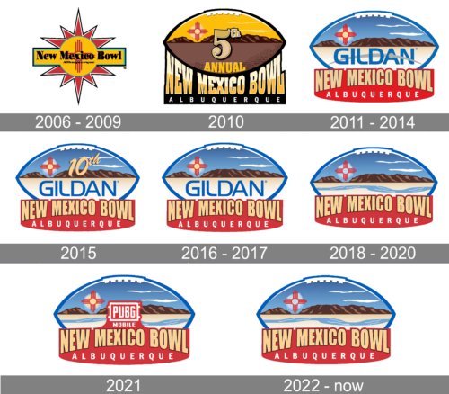
The original badge of the New Mexico Bowl was created in 2006 and is based on a bright and intense yellow and red color palette. It was a horizontally stretched rectangular and a circle, surrounded by sharp elongated red triangles in a double white and black outline. The elements formed a stylized sun. The bold serif “New Mexico Bowl” inscription was written on the rectangle and underlined by a small-sized “Albuquerque” in the same font and color. The yellow circle was decorated by a stylized cross in red.
2010

The redesign of 2010 introduced a completely different concept of the logo. Now it was a horizontally oriented rugby ball in a brown color palette, laying on a solid black badge with the gradient gold “New Mexico Bowl” inscription with the letters vertically stretched. It was a square serif typeface used for the inscription, which made it look stable and powerful. The white uppercase “Albuquerque” was set under the main logotype in a lightweight sans-serif font with lots of space between the letters. As for the ball, it was visually horizontally divided into two parts — a brighter yellow above calm brown and featured two elements on it: the stylized red Crowe in the upper left part, and the “5th annual” inscription in the very center.
2011 – 2014

The New Mexico Bowl logo was refined and modernized in 2011, with the sponsor logotype added to the image. The rugby ball changed its palette and yellow shades were now replaced by blue ones, while the brown bottom part became light beige and got the smooth blue “Gildan” logotype with a bold arched line placed on it. The bottom banner also switched the color from black to red, and the inscription was now executed in a clean and strong sans-serif font, in a sand shade of beige. The “Albuquerque” lettering got enlarged and was better visible now.
2015

To celebrate the tenth anniversary of the bowl the logo was refined in 2015. It was only the smooth cursive “10th” added to the composition — on the upper right part of the rugby ball, executed in the same sand-beige shade as the massive sans-serif “New Mexico Bowl” lettering set on the red banner under the graphical part.
2016 – 2017

The badge from 2011 came back as the primary one in 2016, getting its contours refined and color palette brightened up. Nothing changed much; but the “Albuquerque” inscription started looking more confident, having its lines slightly emboldened and creating a stronger contrast with an elevated shade of red, used for the background of the banner.
2018 – 2020

The 2018 New Mexico Bowl logo featured the name of the game looking very much like it did on every emblem since 2011. The tops of all the letters form an even line, while the bottom parts of the letters form an arch. Similar to the previous emblems, the letters are yellow on the red background, although the shades are slightly different. You can see the football shape borrowed from the previous logos, yet the “film” heritage is also pretty apparent.
2021

In 2021 the New Mexico Bowl gets a new sponsor — the PUBG video game. And the only new element on the logo of the football ball game, added in the same year was its insignia. The bold white “PUBG” inscription is now set on a red background in the recognizable rectangular frame with four short lines coming out of its side to the left and the right. All other parts of the badge remained untouched.
2022 – Today

The redesign of 2022 has only worked on one detail — the red banner of PUBG, the sponsor of the bowl in 2021. Now the badge has returned to its original state, as could be seen in 2018 — 2020. All the main emergents remained absolutely the same.


