Music City Bow is the name of the college football game, which is held annually in the United States. The first game of the bowl was held in 1998 in Tennessee. Today the bowl game is held at the Nissan Stadium, which is located in Nashville and has a capacity of around 70 thousand people.
Meaning and history
Music City Bowl’s first game took place in Nashville, Tennessee, the United States, in 1998. For the opening, the bowl chose Vanderbilt Stadium, but moved to the Nissan Stadium in 1999, and is still played there.
The National Collegiate Athletic Association-affiliated game, which is considered pretty young, has already changed several sponsors and official names. Started under the sponsorship of American General Life & Accident insurance company as the Music City Bowl,’in 1999 the game was renamed Homepoint. Com Music City Bowl, but for just one season. From 2002 to 2009 the bowl was named Gaylord Hotels Music City Bowl, and for another nine years, starting in 2010, — Franklin American Mortgage Music City Bowl.
What is Music City Bowl?
Music City Bowl is the intercollegiate football game, which was first held in 1998, and since then has been played annually at the Nissan Stadium in Nashville, Tennessee. The Bowl is affiliated with the National Collegiate Athletic Association.
1998
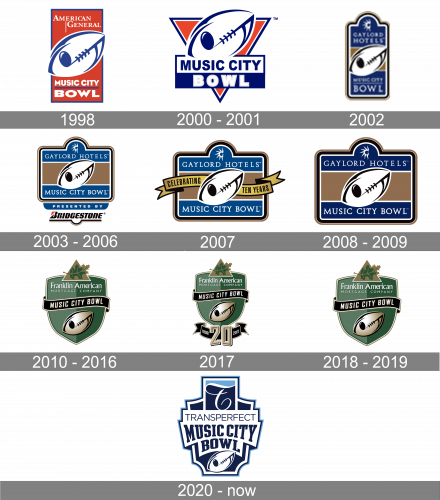
The original Music City Bowl logo featured a strict geometric banner in a bright red, white and blue color palette. It was a vertically oriented rectangle in solid red with the stylized rugby ball set in its center, drawn in plain white with a bold blue outline. The white serif “American General” inscription was set above the diagonally set ball, while the “Music City Bowl” in all capitals of a modern and heavy sans-serif, was written along the bottom part of the badge, in white color, with a thin blue horizontal line separating the two parts of the logotype.
2000 – 2001
The Music City Bowl logo, designed in 1998, featured a simple yet timeless and elegant combination of a red triangle pointing down, and a blue and white emblem with the banner placed over it. The emblem boasted a stylized image of a rugby ball, which was placed diagonally above the rectangular banner with a two-leveled inscription on it. The upper half of the banner was colored white, with the bold blue sans-serif uppercase “Music City” on it, while the bottom half was colored dark blue and had an ExtraBold white “Bowl” in a light gray outline on it.
2002
The redesign of 2002 introduced a completely new concept of the Music City Bowl visual identity. It was a vertically oriented smooth rectangular crest in the blue and brown palette with white elements. The central part of the badge featured a stylized diagonally oriented rugby ball from the original version but was drawn in white and black. As for the lettering, it was set above and under the image, being written in white serif capitals on blue. The upper part of the screwy was taken by the sponsor’s logo — the “Gaylord Hotels” with a stylized half of the sun emblem above it.
2003 – 2006
The badge and all elements remained the same, except for the vertical orientation of the badge changed to a horizontal one. Now all inscriptions became more visible and the overall image — more elegant and stable at the same time. Another important thing about the badge was in the underline — the thin blue “Presented By” banner was glued to the bottom border of the crest and placed above the new sponsor’s logotype. The Bridgestone inscription was set under it in the corporate style and typeface, being underlined by thick black and thin brown lines.
2007
In 2007 the bowl was celebrating its tenth anniversary, hence a special edition of the logo was released. The sponsor’s logotype was removed from the bottom part of the rectangular badge. The whole banner was enlarged and decorated by two elegant curved ribbons coming out of the white rugby ball to the sides. The ribbons had an uppercase “Celebrating Ten Years” inscription in a narrowed sans-serif typeface written over it in black color. All other elements remained untouched.
2008 – 2009
The redesign of 2008 was about simplification. The main badge remained completely untouched, while the bottom sponsorship part — removed. This version of the badge stayed with the bowl for just a few months and became the last of the brown and blue Music City Bowl visual identity era.
2010 – 2016
 The gray banner housing the lettering “Music City Bowl” goes through the center of the emblem, while the name of the sponsor is placed above. There is also a stylized football with a note symbol below the banner.
2017
For the 20th anniversary, a new emblem was designed in 2017. The Music City Bowl logo from 2010 got a bit smaller and was now placed above a black and gold ribbon arched from the center. The ribbon has an enlarged golden “20” in the center, accompanied by a white “1998 — 2017” datemark, set on its sides.
2018 – 2019
The logo design from 2010 came back as the official badge of the Music City Bowl in 2018, after the anniversary game. The badge was absolutely the same, repeating the composition and color palette of its original version. This logo design stayed with the Bowl for another season, being completely rethought in 2020.
2020 – Today
The redesign of 2020 changed the color palette of the Music City Bowl logo to white, navy, and light blue, and switched its shape to a fancy geometric crest with many sharp angles. The upper part of the crest featured a square in two shades of blue with a fancy cursive “T” in white, underlined by the sans-serif “Transperfect” inscription. As for the main lettering, it is now set in bold capitals of a square serif typeface, arched in blue over a white background. The stylized rugby ball in white and blue is drawn at the very bottom of the new crest.
Font and Color
The bold yet pretty modest serif lettering from the modern and bright official logo of the Music City Bowl is set in the uppercase of a square serif typeface. The closest font to the one, used in this insignia, is, probably, Slab Compact JNL Regular, or Gravtrac Condensed Heavy, but with some modifications of the contours.
As for the color palette of the Music City Bowl’s visual identity, it is set in a strong and clean combination of navy blue and white, which looks strict and professional, yet has something progressive in the contrast, and evokes a sense of motion and confidence.


