The logo of Spain’s largest mobile phone operator Movistar looks modern, friendly and recognizable, with its simple curves and minimalistic structure.
Meaning and history
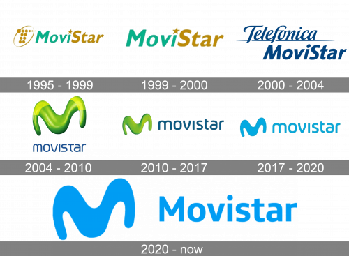
The company, which today is known as Movistar was established in 1995 as MoviStar and used one style of the logo for five years until its name changing to Telefonica Movistar. Finally, in 2004 the name was set and the new visual identity was introduced. It was the emblem, which became a basis for the logo we all can see today.
1995 – 1999
The very first logo was created for the brand in 1994 and featured and turquoise and gold combination, where the logotype was visually split into two parts and placed on the right from a delicate gold emblem. The MoviStar emblem depicted a stylized letter “T”, composed of several solid gold dots, enclosed in an oval frame. The dot above the letter “I” in the wordmark was replaced by a gold five-pointed star.
1999 – 2000
In 1999 the emblem of the brand was simplified and the graphical part was removed. Now it was just the logotype in the same turquoise and gold color palette executed in a traditional sans-serif typeface color which was very similar to Gill Sans MT font.
2000 – 2004
After the company was renamed Telefonica Movistar, the new logo was designed in 2000. It was dark blue lettering in two levels with the “Telefonica” custom cursive underlined and placed above the “MoviStar” in a bold Gill Sans MT font, just like on the previous versions, but with the star above the “I” replaced by a traditional dot.
2004 – 2010
The name “Movistar” appeared in 2004, along with the new visual identity. It was a bright hand modern badged composed of a bold and smooth stylized letter “M” in gradient acid-green, and a blue logotype in the lowercase, executed in a custom sans-serif typeface.
2010 – 2017
The three-dimensional “M” changed its green shade to a darker and a more intense one, white the color of the inscription also became darker and deeper. The wordmark was rewritten in a bolder and more futuristic typeface with distinct cuts of the letter-lines. This was the version of the logo created by the famous Interbrand design bureau.
2017 – 2020
In 2017 the iconic logo was redesigned by Lambie-Nairn. The typeface and the contours of the “M” remained untouched, though the logo became flat and the color palette was changed to a light blue on white, which looked fresh and crispy, showing the company’s progress and achievements.
2020 – Today
In 2020 the blue of the Movistar visual identity was elevated to a darker and more confident shade, and the wordmark was completely changed. The lowercase lettering was replaced by a title-case inscription, with the first “M” capitalized. The new wordmark is executed in a more traditional and serious typeface, which was designed exclusively for the brand and is called Telefonica Headline.
Font
The grotesque sans serif typeface featured on the Movistar logo bears some resemblance to the FF Max Book font, although the wordmark has probably been drawn by hand rather than based on a font.


