Mind is a British charitable organization, specializes in helping people with mental health problems. Mind was established in 1946 and by today has helped hundreds of thousands of people. The current president of the organization in Stephen Fry.
Meaning and history
The current Mind visual identity is something really stylish and modern. While its original version of the logo was classic and modest, the one, created in 2003 is a reflection of progressiveness and development.
The 1990s – 2003
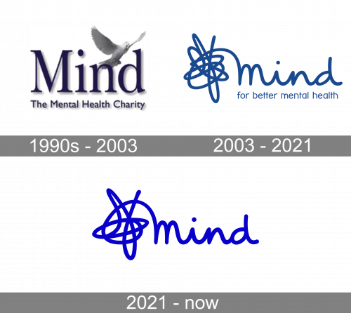
The logo, designed for Mind in the 1990s was composed of an elegant wordmark in the title case, executed in a lightweight serif typeface. Being underlined with “The Mental Health Charity” inscription in modest sans-serif, the lettering boasted a thick light gray shadow, which made it look vivid and fresh. The only graphical element of the logo was a white pigeon, flying above the wordmark to the right. The bird was drawn very detailed, looking alive, and added peacefulness and freedom to the composition.
The white and blue color palette represents responsibility and loyalty, showing the organization as a professional and trustworthy.
2003 – 2021
The only thing, that left almost unchanged in 2003 was the white and blue color scheme. Though the Mind blue now is lighter and chicer. All the other elements were completely redrawn.
The Mind logo is composed of lowercase lettering in a rounded sans-serif, which looks like clumsy handwriting. On the left of the inscription, there is a scribble in the same color and thickness. It shows the difficulties and problems the organization helps with.
Under the main part of the logo, there is a thin tagline “For Better Mental Health” written one a lightweight sans-serif with a lot of space, which adds freshness and elevates the whole look.
2021 – Today

The 2021 Mind logo is their wordmark (with the scribbles and all), but brighter.


