Although the typeface of the Miele logo has been modified more than once, there was a specific design element that was present in the wordmark throughout most of the company’s 120-year history.
Meaning and history
Miele is the brand, known for its unsurpassed quality and exquisite design, which can be seen not only in the products of the company but also in its visual identity design, which undergone only one major redesign in 1949. It says a lot about the brand’s values and fundamental approach to production and technologies.
1899 — 1949
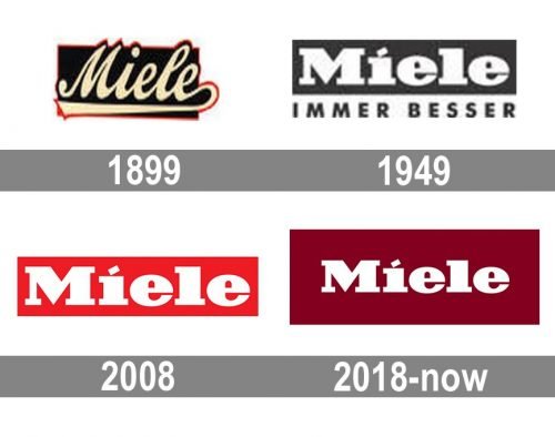
The very first logo for Miele was introduced in 1899 and stayed with the brand for dirty years. It was a pretty simple composition, formed by a script logotype in a rectangular background. The lettering with smooth curved lines was executed in pale yellow and had a thin red outline, while the background was black and featured the same red framing as the inscription.
1949 — 2007
The logo we all know today was created for Miele in 1949 and featured a bold and massive white logotype placed in a black horizontally stretched rectangle with an “Immer Besser” tagline under it. The main inscription on the logo was executed in an extra-bold serif typeface and had the dot above the letter “I” replaced by a delicate diagonal rectangle. As for the tagline, it was written in all capitals of a traditional strict sans-serif typeface.
1949 — 2018
Later in the same year, another version of the logo was adopted by the company. It featured the same style and typeface, but the tagline was removed and the color palette was switched to white on red, which looked powerful and stylish, evoking a sense of energy and professionalism and showing the Miele values of its customers and their happiness.
2018 — Today
The redesign of 2018 hasn’t changed much in the Miele logo, it is still the iconic white logotype placed on a solid rectangle, but now the rectangle is bigger and its scarlet-red shade is replaced by a burgundy one, which adds seriousness and luxury to the brand’s identity and makes the whole logo look professional and exclusive.
Symbol
The script wordmark was replaced by a bold serif one by 1932. Since then, the logo has been fairly consistent in its overall design and style, as well as the use of the rectangular shape instead of the dot above the “i.” Yet, the letters definitely haven’t remained exactly as they were.
Emblem colors
The combination of white and a bright shade of red looks eye-catching and optimistic.
Font
The bold serif font would have had a generic and even old-school feel if not for the unusual design element over the letter “i.”


