The Michigan Wolverines logo has undergone around seven profound updates since 1912.
Meaning and history
The visual identity of Michigan Wolverines has been pretty constant since 1964, with just some slight modifications, its current emblem is based on the version of the 1960s, and keeps its yellow and blue color palette, reflecting energy, reliability, and professionalism. Though the first two badges, designed for the team were completely different.
1912 – 1948
The original logo for Michigan Wolverines, introduced in 1912, featured and blue and red composition placed on a white background with a solid blue wolverine in a red outline located under an arched blue “Michigan” wordmark in a typewriter-style serif font. It was pretty common and traditional for its times’ emblem, which looked modest yet bright.
1948 – 1964
In 1948 the logo was replaced by a cartoonish wolverine’s portrait in a hat with the letter “M” on it. Blue was still the main color, but the red accents were fine and the new color palette consisted only of two shades — blue and white, a combination standing for loyalty and professionalism.
1964 – 1979
The redesign of 1964 brought a new strong logo to Michigan Wolverines. It was an extra-like geometric serif letter “M” in yellow with a thin blue outline, and a blue and white wolverine looking to the left, placed over the letter. The clean contours and solid shapes of both elements made the logo balanced and strong, and the new color palette evokes a sense of dynamics and progress.
1978 – 1988
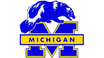
The logo was changed in 1978, by placing the wolverine above the “M” and turning it to the right. The badge with “Michigan” was now crossing the letter of the emblem in its middle, and the color palette was brightened and lightened up. Now both the animal and the “M” were colored blue, while the horizontally stretched banner was in yellow, complemented by the same outline of the “M”.
1988 – 1996
In 1988 the wolverine was removed from the MW logo, and the color palette for back to its original version — the blue became darker and stronger. The new logo featured a thickened letter “M” with its body in blue, and a distinct yellow outline, and a blue rectangular banner with a yellow frame and “Michigan” lettering in capital letters of a confident and mail ole sans-serif typeface.
1996 – 2012
The redesign of 1996 switched the colors of the logo, by drawing the banner with the nameplate in yellow and outlining it in blue. As for the “M”, its blue shade became a bit lighter, and now it featured a double blue and yellow outline. The lettering on the banner changed its typeface to a more extended and modern sans-serif, and now the logo was very well balanced.
2012 – Today
Michigan Wolverines divide to go more minimalist in 2012, by removing the banner with the wordmark and keeping only one “M”. Now the letter is executed in yellow and boasts a thin yet distinct blue outline. The clean straight lines and massive square serifs of the letter represent stability and confidence along with the courage and professionalism of the sports team.
Michigan Wolverines baseball
Currently coached by Erik Bakich, the Wolverines have a long history. It started in 1866. Since then, they’ve been the NCAA Tournament champions twice and have participated in the NCAA Tournament 24 times.
Michigan Wolverines basketball
The history of the men’s basketball team of the University of Michigan started in 1909. The Wolverines have had 1–6* (1–4) championship game record in the NCAA Tournaments in 29* (25) appearances. They have appeared in the National Invitation Tournament 10* (9) times. The women’s team has made eight NCAA Tournament appearances.
Michigan Wolverines Colors
BLUE
PANTONE: PMS 282 C
HEX COLOR: #00274C;
RGB: (0, 39, 76)
CMYK: (100, 60, 0, 60)
MAIZE
PANTONE: PMS 7406 C
HEX COLOR: #FFCB05;
RGB: (255, 203, 5)
CMYK: (0, 18, 100, 0)


