The bull on the Merrill Lynch logo is so memorable it was not dismissed even when the company went defunct and became part of Bank of America.
Meaning and history
Merrill Lynch was founded in 1914 by Charles Merrill. A little later he was joined by his friend Edmund Lynch. Over the years, the firm grew into an army of brokers across the country, sometimes called the “thundering herd” because of the bull image on the logo. The such activity helped to attract the masses of Americans to invest, and the company itself became an impressive investment bank.
In the 2000s, Stanley O’Neill, who headed the investment bank, pursued an aggressive growth policy, which led to serious problems for the company and its subsequent sale to Bank of America.
What is Merrill Lynch?
Merrill Lynch is the name of an American investment company, which was established at the beginning of the 20th century, and by today has grown into one of the most famous companies, engaged in brokerage and related financial services all over the globe.
1914 – 2009
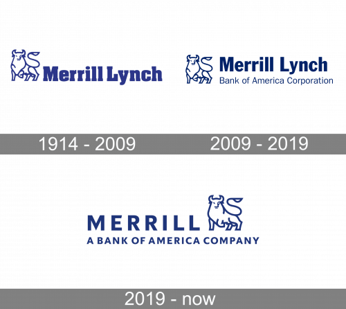
The company was established in early 1914. One of the oldest logotypes (it was introduced in 1914) featured the lettering “Merrill, Lynch & Co.” in a type that combined classic structure with decorative details. On the one hand, the letters looked average enough to remain perfectly legible. On the other hand, you could notice pretty curves and other seemingly unnecessary elements adding a unique touch.
Another historic logo is the one fearing a bull poised to charge. It symbolizes strength and aggression. The design was inspired by the term “bull market.” As the term refers to a market where share prices are rising, encouraging buying, the bull here also promises prosperity.
Next to the emblem, you can see the shortened name of the brand in a different, more business-like serif type. Here, only the initials are capitalized. The letters are rather bold. The top curves on the “r’s” seem to have been cut a little to make the wordmark shorter and more proportional.
2009 – 2019
The new logo looked pretty much the same, with a couple of notable modifications. For one, the lettering “Bank of America Corporation” appeared below. Also, the words “Merrill Lynch” were now given in a simpler, sans serif type. The new palette combined a rather bright shade of blue with white.
2019 – Today
Following significant losses, the bank was sold to Bank of America in 2008 and became its division. In early 2019, the name of the division was changed from “Merrill Lynch” to “Merrill.”
The updated Merrill Lynch logo features the word “Merrill” in an all-caps sans. The bull has moved to the right. Below, you can see the writing “A Bank of America Company.” While it is also given in an all-caps sans, the letters are smaller. The blue has grown darker.
Font
With each new logo, the type has been growing simpler. The ornamental original font was soon replaced by a “serious” serif one and then, eventually, by a cleaner sans.
Company overview
Today, Merrill is an investment and wealth management division of Bank of America. It specializes in prime brokerage and broker-dealer activities. It is based in New York City. The number of financial advisors it occupies exceeds 14,000.


