McDonald’s is one of the most famous and popular fast-food restaurant chains in the world. For many years, it has attracted millions of visitors every day by offering delicious, affordable, and varied food. The chain includes more than 36 thousand restaurants in 120 countries around the world. The company continues to evolve and offer new products and services to meet the needs of its customers. However, today McDonald’s is not just about food. The brand has become part of world culture, a symbol of globalization and the American way of life, and the McDonald’s logo is an essential part of this image.
Meaning and history
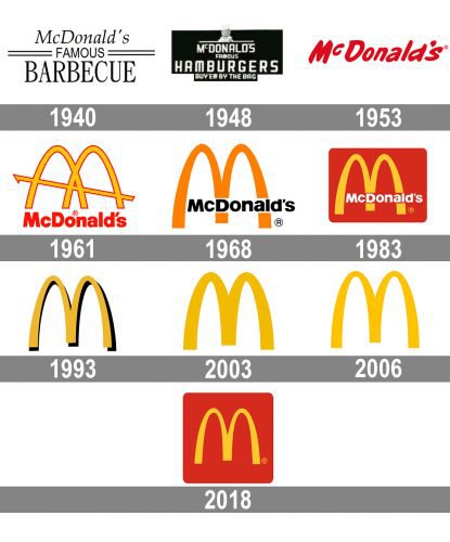
The story of the world’s most famous fast-food restaurant chain began in 1937 when Patrick McDonald launched “The Airdome”, the first restaurant of the family. Three years later his sons renamed it to “McDonald’s Famous Barbecue”.
The current title was adopted by the company only in 1953, and the design prototype of the iconic Golden-Arches logo was created in the 1960s. Since that time the visual identity of the fast-food legend was pretty constant and by today it became one of the brightest examples of perfect branding in modern history.
What is Mcdonald’s?
Mcdonald’s is one of the most popular chains of fast-food restaurants in the world. The company was established in 1940, and today has around 40 thousand locations all over the globe (most Mcdonald’s restaurants are franchises). The menu of the chain is based on burgers.
1940 – 1948
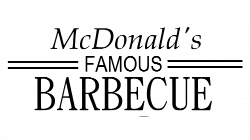
The very first logo for the restaurant was composed of a black wordmark, set in three levels, and executed in three different styles.
The upper part featured the “McDonald’s” inscription in an italicized serif font, which was elegant and traditional. The “Famous” in all capitals was written in sans-serif and placed in the middle and had two parallel horizontal lines coming out of it to both right and left. As for the biggest and boldest part of the whole logo, the “Barbecue” inscription, was executed in a strict and solid serif font and located on the lower level of the logo, being its main part.
1948 – 1953
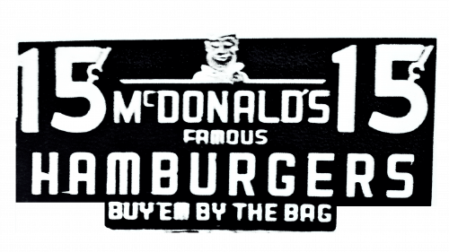
The Barbecue concept was replaced by Hamburgers, which were getting more and more popularity in the USA. The title of the restaurant was altered in 1948 and the logo was redesigned. It was now composed of a white “MacDonald’s Famous Hamburgers” nameplate on a black background, with a small white image of the Chef, who was friendly smiling. The inscription was executed in one style, using a modern sans-serif typeface. This logo only lasted for 5 years.
1953 – 1968
The company finally changed its name to simply MacDonald’s and this is where it all begins. The logo was still far from what we all know today, but the red color appeared in the color palette, giving the right direction for the brand.
The smooth italicized wordmark in red was executed in a custom sans-serif typeface with thick sleek lines. It was a pretty memorable and recognizable logo, which stayed with the company for 15 years.
1961 – 1968
In 1961 Stanley Meston creates the emblem, the whole world knows today. The iconic Golden Arches logo was inspired by the architecture of the first company’s restaurants, specifically their roofs. This is why there is a diagonal line coming through the arches on the first version of the logo.
The emblem in yellow has a thin red outline and the red wordmark was placed under it. The new inscription was executed in a bold and simple sans-serif typeface, putting the main accent on the emblem.
1968 – Today
The logo was simplified in 1968. The diagonal line was removed and the inner ends of two arched were shortened, which made them look more like a letter “M”. As for the color palette, it now featured yellow for the emblem and black for the wordmark, which was placed over the “M” on its lower part.
The typeface of the nameplate was also slightly refined, making the letters more solid and visible.
This logo is still in use today on come of the products and international restaurants of the company.
1975 – Today
The new look was brought to the visual identity in 1975. The emblem with the wordmark was placed inside a red rectangle with rounded angles. The lettering was switched from black to white, which looked friendlier and more welcoming.
This insignia is probably the most recognizable version of all the fast-food legend logos and is still used by the company, being instantly recognizable across the globe and evoking a sense of joy, happiness, and passion.
1993 – 2010
The version of 1993 featured a simple yellow “M” with a black shadow, no lettering or framing, just a minimalist emblem, which was first used only in the United States, but later became international and stayed with the company for almost twenty years.
2003 – Today
The same minimalist approach was followed at the beginning of the 2000s when another version of the logo was designed. The flat yellow “M” was placed inside a red square with rounded angles.
It wasn’t used much in the beginning but was slightly modified in 2018 and the brand started to use it extensively. Along with two other versions.
2006 – Today
In 2006 the flat yellow design was created for the brand. The most minimalist amongst all the versions, today it is widely used by the company for both domestic and international markets. A clean and neat “M”, composed of two arches, is executed in yellow and placed on white. No outline, no lettering, nothing. It looks modern and stylish, reflecting the company’s heritage and making people all over the globe smile and think of happy moments.
2018 – Today
The 2018 design is the same yellow emblem they used for a long time, but placed inside a red square with rounded corners.
Font
The current McDonalds logo features a customized sans-serif font. You won’t see a single capitalized letter, even “I” is given in the lower case.
Color
The emblem exists in the two color schemes: black and yellow/red. The yellow/red one is used whenever a colorful representation is possible, while the black one is used in black-and-white visual contexts.
What does the McDonald’s symbol represent?
The iconic symbol of McDonald’s is a stylized letter “M”, composed of two Golden Arches. First of all, the symbol stands for the name of the company, and depicts its historical legacy, as the arches structured the first restaurants of the chain.
Why did McDonald’s pick its logo?
McDonald’s logo is a combination of different meanings, which all are combined in one pretty minimalistic symbol, the uppercase “M”. The letter is composed of two Golden Arches, which represent the first restaurants of McDonald’s, and also look like a feeding breast, an ancient Freudian symbol.
Why is the McDonald’s logo so successful?
The logo of McDonald’s is as successful as the fast food chain itself. It combines a minimalistic approach, with no graphical details, a bright color palette, which evokes a sense of warmth and friendliness, a custom uppercase “M”, representing the name of the company, and the two Golden Arches, which look like mammaries. So all the essential elements of a successful visual identity design.
What does the McDonald’s logo symbolize?
The McDonald’s logo symbolizes the love and caress of the company toits customers. Its warm color palette and smooth contours with rounded angles look friendly and welcoming, evoking a sense of reliability and safety.
Does the McDonald’s logo represent breasts?
The McDonald’s logo is based on a stylized letter “M”, composed of two Golden Arches, which do look like women’s breasts. The design consultant of the company, Louis Cheskin, says that the arches in the McDonald’s badge represent the “Freudian symbolism of a pair of nourishing breasts.
What do McDonald’s golden arches symbolize?
The Golden Arches on the McDonald’s carry two meanings. First of all, they stand for the historical legacy of the company, as the first restaurants of the chain had arches in their architectural design. Secondly, the golden arches on the McDonald’s logo are believed to represent women’s breasts.
Is there a hidden meaning in the McDonald’s logo?
At the first sight, the Mcdonald’s logo looks pretty direct and literate, with the sleek bold letter “M” representing the name of the company. But the meaning behind the McDonald’s badge is a bit deeper than you might have thought, with a hidden meaning in it.
What is the hidden message in McDonald’s logo?
The hidden meaning of the iconic Mcdonald’s logo is the caress and love of a mother to her children, depicted in two smooth Golden Arches, which form the capital letter “M”. The arches resemble the feeding breasts of a woman.
When was the McDonald’s logo created?
The predecessor of the iconic McDonald’s logo we all can see today was designed in 1961, and in 1968 gained the contours of the current version. The red background appeared in the concept in 1983 and then came back in 2018, after a long break.


