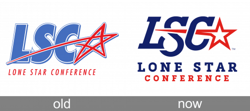
The Lone Star Conference (LSC) is an NCAA-affiliated collegiate athletic conference (Division II). Both the current and the old logos were inspired by the “Star” name, yet they did not look the same.
Meaning and history
Birthed in the heart of Texas in 1931, the Lone Star Conference embarked on its journey as a guiding force in collegiate sports within the region. Initially formed to oversee college sports, primarily football, in Texas, the conference has since blossomed into a multi-sport entity, embracing both male and female athletes. Its historical tapestry is adorned with significant milestones, such as hosting numerous national championship events and being the cradle for many athletes who later shone in professional arenas.
As the years unfurled, the Lone Star Conference adapted to the ever-changing landscape of American collegiate sports through strategic expansions and realignments. This adaptability has cemented its status as a beacon of competitive excellence and sporting integrity. Presently, the conference continues to thrive as an influential force in collegiate athletics, offering a diverse array of sports and nurturing a balanced development of academic prowess and athletic talent. It stands as a vibrant contributor to the rich narrative of college sports in the United States, perpetually fostering the spirit of competition and excellence.
What is Lone Star Conference?
Lone Star Conference is the intercollegiate athletic organization, which was established in 1931 and today is composed of 18 college members from the southwestern states of the USA. The conference fields 18 sports disciplines for men’s and women’s athletic teams.
Old

On the old emblem, the abbreviation “LSC” was bolder. It was given in a sans serif type and featured a lighter shade of blue. The star was uneven.
The original Line Star Conference logo was executed in a light-blue, red, and white color palette with the “LSC” abbreviation set in a heavy italicized sans-serif typeface, with the light blue capitals in a medium-Weight white outline. On the right of the inscription, a stylized contoured red and white five-pointed star was drawn. The Star looked as if it was hand-drawn, and it made the whole logo look friendly and cool. The whole badge was underlined by clean red “Lone Star Conference” in a modern sans-serif typeface with the uppercase letters slightly italicized.
Today

The current Lone Star Conference logo features the abbreviation “LSC” in a rather light serif font. The letters have varying height. To the right, a five-pointed star can be seen. Its top-left end is stretched and goes through the “S” and “C.” The lettering “Lone Star Conference” in two lines is placed below.


