

![]() WBC Logo PNG
WBC Logo PNG
The WBC came into existence in 1963. It was this boxing organization that first became concerned about safety and introduced new requirements in the sport that are still relevant today. One of these rules was the reduction of rounds from 15 to 12, and there were more weight categories so that athletes could comfortably compete on their own.
Meaning and history
![]()
The WBC (World Boxing Council) is one of the 4 main institutions that initiate professional boxing fights, along with the WBA, IBF, and WBO. The council has produced many exciting, sometimes epic fights, and the titles offered are considered some of the most honorable achievements of any professional boxer.
In its early stages of development, the WBC was governed by only 11 founding countries, which included the United States, France, Argentina, Brazil, and other nations. The reason for its creation was to expand and introduce boxing ideals to the masses and to more scrupulously control the respective fight commissions.
Unlike the WBA and WBO, where there are titles of champions and super-champions, the WBC also gives out the title of Diamond Champion (the winner of a fight between elite boxers) – the first one was given to Manny Pacquiao in 2009 when he beat Miguel Cotto. There is also the Silver Champion, a title that is fought for if the current champion is unable to defend his title. The WBC Silver holder is essentially the interim champion and the next challenger for a world title fight.
The International Boxing Union (IBU International Boxing Union) is closely connected with the World Boxing Council, it is the oldest boxing organization, which has been operating since 1910 and was called EBU (European Boxing Union) until 1946.
The belt of the association is made of green color, on the buckle there are flags of the countries, which are members of the council – 161 flags. In the center is the silhouette of a boxer with a raised arm. The belts are the same in different weight categories. The association fights 2-3 times a year. Top 10 athletes-leaders, can claim to fight with the current leader.
What is WBC?
WBC is an abbreviation standing for the World Boxing Council, an organization founded in 1963, a year after the WBA. WBC is often regarded as boxing’s most prestigious sanctioning body. It has been at the forefront of organizing some of the most memorable and high-profile fights in boxing history, including the legendary Fury vs. Wilder trilogy.
In terms of visual identity, the World Boxing Council is super modern and stylish. The bright elements, which make up the composition, look just and strong on a plain white background, and the image of a boxer perfectly transmits the triumph and winning spirit of a sportsman.
1963 – 2013
![]()
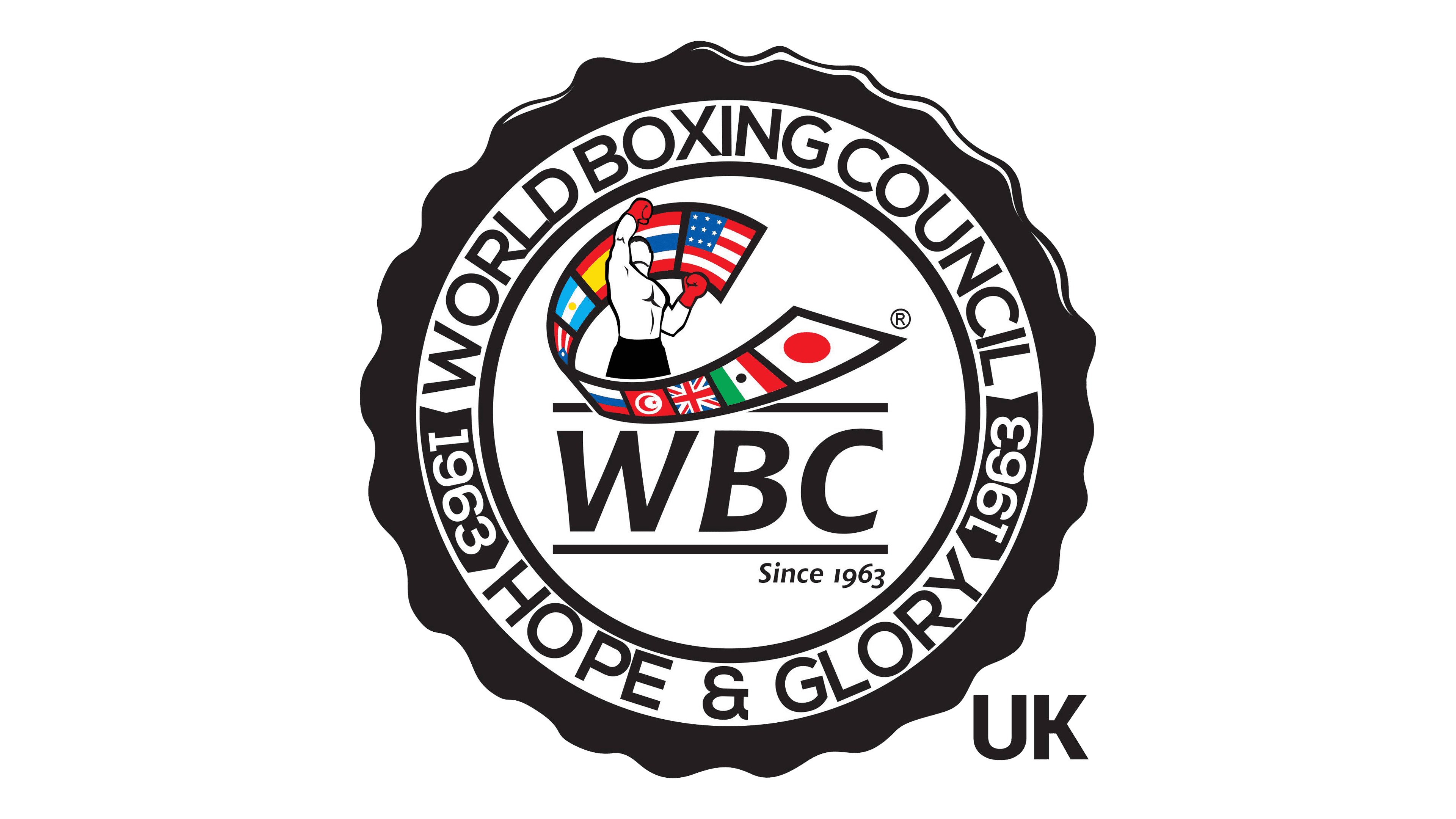
The old logo of the World Boxing Council featured an image of a contoured figure of a boxer standing with one of his arms stretched up, and “wrapped” in a wide ribbon, formed from ten national flags of different countries. The ribbon featured a thick black outline, which balanced the black contour of a boxer. The whole image was underlined by a bold italicized “WBC” abbreviation written in a custom sans-serif typeface, also in black.
2013 – Today
![]()
The redesign of 2013 has introduced a rethought logo of the World Boxing Council, with the main elements kept, but refined. The boxer was redrawn in a new pose — with his head up, following the hand. In this position, the figure of a man depicts a win much brighter than the boxer from the previous version. The flag ribbon was also redrawn, with some of the flags shifting their places on it. A thin black horizontal line was added to the composition to separate the graphical part of the logo from the text, which is now executed in a distinctive sans-serif typeface with slightly flared bars. Another line is underlining the whole composition, creating a frame for the abbreviation.
Font and color
The bold modern lettering from the official logo of the World Boxing Council is set in a fancy sans-serif font, which looks pretty similar to such commercial types as Chianti BTtrade or LFT Arnoldo. It looks very balanced, as the characters are set at quite a significant distance from each other.
As for the color palette of the World Boxing Council’s visual identity, its main shades are white, black, and red, but there are also additional colors, which are used for the National flags. As for the primary tricolor — it stands for strength, fight, and manliness.


