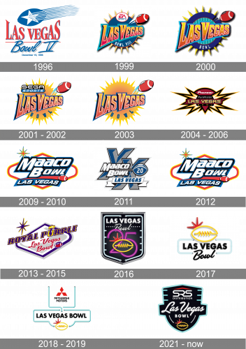
When in 2018 Mitsubishi became the official sponsor of the Las Vegas Bowl, the logo of the bowl game was redrawn from scratch. The emblem can be broken down into two parts. The top part comprises the red Mitsubishi badge and the name of the company inside an open shape with a light blue outline. Below, you can see another open shape housing the text “Las Vegas Bowl” and a yellow football.
Meaning and history
Incepted in 1992 by the visionary Tina Kunzer-Murphy, the Las Vegas Bowl emerged as a cornerstone in collegiate football’s postseason landscape. This annual football contest swiftly rose to prominence by offering a platform for teams from diverse conferences to showcase their prowess. A hallmark of the Las Vegas Bowl is its history of pitting formidable teams from the Mountain West Conference against their counterparts from the Pac-12, leading to many enthralling and competitive games. Over the years, the bowl has been lauded for its vibrant atmosphere and its role in accentuating the spirit of college football. Presently, it stands as a beacon in the college football postseason, continuing to draw in throngs of enthusiasts and sustaining its legacy of delivering high-caliber football entertainment.
What is Las Vegas Bowl?
Las Vegas Bowl is the intercollegiate annual football game, which was first held in 1992. The postseason game is affiliated with the first division of the National Collegiate Athletic Association and has its championships played at the Allegiant Stadium in Paradise, Nevada.
1996

The Las Vegas Bowl logo, created in 1996, was executed in a patriotic blue and red color palette, with the lettering written in two levels and two completely different styles. The upper line, “Las Vegas”, was set in calm red color, using an elegant serif font with softened contours and a thin blue shadow. As for the bottom line, it featured “Bowl V” in a handwritten cursive, blue color, and a more visible gray shadow. The levels were separated by a very thin red horizontal line, and the upper part of the logo was decorated by a simple blue and white emblem, depicting a solid rugby ball with a five-pointed star on it and several white and blue lines coming out of the ball to the right, representing speed and motion.
1999
The sharp and modern badge was designed for the Las Vegas Bowl in 1999. A solid blue circle with short and sharp triangular rays in gradient orange had a diagonally placed inscription in the same orange palette written over it and was decorated by a red rugby ball flying above it. On top of the badge, there was a white circle with the “EA” sponsor’s logotype, under the “Las Vegas” wordmark — arched “Bowl VIII” in white capitals.
2000
The redesign of 2000 made the badge brighter and more memorable. The palette was changed from the traditional tricolor to juicy yellow and orange gradients on a blue and purple background, with red and white rugby ball, flying out of the badge. Now the stylized logotype was set a bit diagonally on a background, composed of a patterned circle enclosed into a wide blue frame with numerous yellow spikes. It looked like a boat steering wheel, although evoked a sense of danger and motivation due to the pointed ends of the yellow elements.
2001 – 2002

The concept remained unchanged, but the color palette was switched in 2001. The blue circle from the background turned into a bright yellow stylized sun with the sharp rays of different lengths coming out of it. The red rugby ball was slightly refined too, and now got two light blue arched lines coming out of it, which made the ball look like flying rockets as for the logotype, it remained unchanged but got accompanied by one more inscription, the “Sega Sports, new sponsor of the bowl, was written in its corporate style above the gradient orange “Las Vegas”.
2003
The Sega Sports logotype was removed from the badge in 2003. All other elements were cleaned and emboldened but stayed in their place and their original colors. The new badge was brighter and stronger due to prevailing yellow and orange shades.
2004 – 2006
Pioneer became a sponsor of the Bowl in 2003, and the logo was changed in the same year. The new concept was based on a dark yet elegant black yellow and burgundy color palette, with some white elements making it look a bit lighter and fresher. The logotype of the sponsor in white was written over the top part of the logo, which was a solid black circle in a yellow outline. The bottom part of the badge was overlapped by a triangular crest in burgundy, with the stylized modern wordmark and sharp yellow-white, and black rays coming out of it.
2009 – 2010

Another redesign was made into the Las Vegas Bowl logo in 2009. A gradient bold inscription in two levels was underlined by a red trace of a flying rugby ball, which was moving to the right. Under the arched line, there was a blue banner with the shadowed “Las Vegas” wordmark in all capitals of a modern and confident sans-serif typeface. The whole composition was placed on a white background with the overlapped rhombus in red and yellow, having its side angles rounded. A sharp and elegant eight-pointed star in yellow, red, and blue was set in the upper left corner of the badge.
2011

For the season of 2011 the Maaco Bowl logo was redrawn in a calm and brutal gray and blue color palette with some white and black elements. The badge was composed of two enlarged stylized “X”s, standing for the twentieth bowl game, a rugby ball on the left, drawn in the same color palette with the gray “20” on it, a two-leveled “Maaco Bowl” in smooth while sans-serif, and a horizontally placed ribbon with capitalized and slanted “Las Vegas” in blue.
2012
In 2012 the bowl came back to its badge, designed in 2009, enlarging all the elements and cleaning their contours. Nothing new was added to the composition, but the lines got a bit bolder hence the whole image started looking more confident and professional.
2013 – 2015

The interesting shape of the crest was kept after the redesign of 2013, but now got a new deep blue shade and a diagonal orientation. The star was also on its solace in a new blue and yellow palette. As for the lettering, the upper part now featured the “Royal Purple” logotype in its corporate style, and the Las Vegas Bowl inscription split into two parts. The first was written in red cursive over the light gray background, while the second was set in white bold capitals on a red ribbon, replacing the “tail” of the red rugby ball, flying to the right.
2016

For the 25th season of the bowl, the new logo was introduced in 2016, and it was executed in a true Vegas-style — with Neon pipes and black gradients on the background. It was a classy crest with gradient white “Las Vegas” in bold sans-serif capitals on top, a diagonally set “Bowl” in cursive underlining it, and the stylized fuchsia pink “25” as the largest element. The number was overlapped by a yellow contour of a rugby ball, made of a neon pipe with bulbs on its ends. The whole crest was enclosed in a sharp metallic frame from the outside and cold white neon pipes from the inside. It was a cool and recognizable logo, which only stayed in use for one season. No sponsor logotype was added to it.
2017

The cool yellow rugby ball, which was made up of brine pipes on the logo, designed in 2016, was transferred to the new badge, introduced in 2017. Though this time it was executed in a flat simple line, placed on top of the badge, and accompanied by a red sharp star, which was hiding behind its right part. The bold sans-serif “Las Vegas” was set under the ball in black and enclosed into a smooth turquoise frame, with the cursive slightly diagonal black “Bowl” overlapping it at the bottom.
2018 – 2019
The framing of the badge became three-dimensional again in 2018. The color palette remained the same, but now with some light gradients, which made the lines look like neon pipes again. The yellow rugby ball moved to the bottom of the logo, while the upper part now contained the logotype of the new bowl’s sponsor, Mitsubishi Motors, which was written in its corporate typeface under an enlarged red Diamond emblem. The upper part of the logo was also enclosed into a frame composed of turquoise neon pipes, connected to the bottom element.
2021 – Today
The Neón Las Vegas Bowl logo turned black in 2021. The light blue contours remained, but the shape and background of the logo changed. Now it was a traditional crest with the “SRS Distribution” white and red logotype placed on top of the badge, the fancy white “Las Vegas” in cursive in the center, heavy sans-serif “Bowl” in all capitals under it, and the yellow neon rugby ball at the very bottom.


