La Poste is a postal service company in France. The history of the company can be traced back centuries. In the Middle Ages, postal delivery was performed by private enterprises, and it was only during the French Revolution that it became a fully public service. In 1879, post and telegraphs merged under the lead of the French government, and the P&T (“Postes et télégraphes”) was formed, which later was turned into the PTT (“Postes, télégraphes et téléphones”). Eventually, however, the two branches were split, and La Poste was officially created in 1991.
Meaning and history
Since 1960, the La Poste logo has been based on the same symbol: a stylized blue bird in flight, the so-called “postal bird” (“l’oiseau postal”). The bird drawn by Guy Georget symbolizes a messenger. The arrow shape, in its turn, symbolizes the speed at which the company delivers messages. However, before the company adopted the bird symbol and started experimenting with its shape, it went through a series of other logos.
What is La Poste
La Poste is headquartered in Paris, France. It works in Metropolitan France, and also delivers its services in the five French overseas departments and regions.
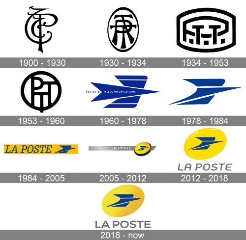
1900 – 1930
The oldest logos on the list experiments with the old names of the company, the P&T or the PTT. Typically, they represented the letters interlaced in an intricate manner. The version used over the first three decades of the 19th century was exceptionally elegant with its curves and smooth transitions from thin to thick.
On the downside, it was barely legible and looked more like a monogram of an aristocrat.
1930 – 1934
This one looks more modern due to simpler shapes. Yet, the monogram effect is still there.
1934 – 1953
This version looks even more modern because the letters have simpler shapes, there are no elaborate curves, and decorative details are fewer.
1953 – 1960
The design is a bit simpler, yet the legibility problem is still there.
1960 – 1978
This is when the iconic blue bird appeared, which has been present in the La Poste logo ever since. The bird seems to have been made out of a piece of paper, which supports the “message sending” interpretation.
Originally, the bird was often not colored blue but was embossed over yellow surfaces of buses and post boxes.
1978 – 1984
The bird was redrawn by the same person who had drawn the original, Georget. On the one hand, it lost symmetry. On the other, it now looks more dynamic – you can feel it is in flight, not just understand it with your conscious mind.
1984 – 2005
Here, the bird is placed to the right of the wordmark. The wordmark is set in a serif type. Not a historic one, with elegant curves, but a simpler font where all the lines have almost the same thickness.
The wordmark and the emblem are placed over the yellow background.
2005 – 2012
The bird is now placed inside a yellow ellipse. Due to the gradient, the ellipse has adopted a 3D touch, so the emblem looks like an embossed badge. The name of the brand is placed inside a gray stripe going behind the blue badge. The type is a sans, and it looks more laconic than its predecessor.
2012 – 2018
The badge has been made larger. The stripe has disappeared. The wordmark is placed below the ellipse and is given in gray over the white background. The simple italicized type provides excellent legibility and adds a dynamic touch that mirrors the feeling of motion communicated by the emblem above.
2018 – present
The badge has grown a bit flatter as it lost the shades and some of the highlights. However, there is still some dimension. The type has been straightened.
Colors
Since the 1960s, the primary color associated with the brand has been yellow. Before that, postal vans were green, while the post boxes were blue. The choice of yellow can be explained by the fact that it’s an eye-catching color connoting light and speed.


