John Hancock Insurance Company has had a steadfast presence in the American insurance landscape for over 165 years. Over the years, it managed to earn not only a good reputation but also create a very diverse portfolio of insurance services. John Hancock owns the International Group Program (IGP), which unites 830 companies and has offices in 80 countries of the world. John Hancock is part of Manulife Financial Corporation, which is one of the largest financial companies in the world.
Meaning and history
The company was founded in 1852 by John Hancock, one of the first signers of the Declaration of Independence. In the early years, John Hancock Insurance Company focused on offering life insurance policies to the growing middle class. As the company expanded, it diversified its product portfolio. Despite the Great Depression and two World Wars, the company persevered thanks to its core values. In the latter half of the 20th century, it expanded its global footprint, reaching Canada, Asia, and Latin America. The company continues to thrive, determined to meet the evolving needs of its customers. For instance, in 2018, the company introduced a new approach to life insurance. The Vitality Go app allows users to track their health and receive bonuses when reaching health goals. Vitality policyholders take nearly twice as many steps as the average American.
What is John Hancock?
John Hancock is an American insurance company. It has historically earned a reputation as a stable and honest insurer that is trusted in all corners of the world. The S&P rating of “AA” is a confirmation of this.
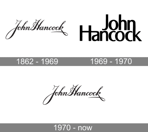
1862 – 1969, 1970 – Today
The original logo of John Hancock Insurance Company, introduced in 1862, features a stylized depiction of the American patriot John Hancock’s signature. It is a demonstration of the company’s commitment to tradition and stability. The signature is written in a classic cursive script with high-stroke contrast, conveying a sense of strength and unity. The fact that the company has used the same logo since the foundation (except for one year) serves as a testament to John Hancock Insurance Company’s enduring commitment to its founding principles and values.
1969 – 1970
The Sandgren & Murtha design company aimed to reflect the rich history of this strong brand when updating the logo. The attempt to introduce a new logo after using the same one for over a century showed the company’s commitment to innovation. The logo evokes a sense of trust and reliability thanks to bold strokes. The name is stacked, yet united, which shows that the company has a strong connection with its customers. The overall design is simple, yet powerful.
Font and Color
The original logo features a very elegant and sophisticated cursive font. In fact, it is a real signature that was stylized as a logo. The logo used for a brief time during the late 1960s features a sans-serif font that resembles Indecise SemiCondensed Regular font and Newbery Sans Pro Medium font. The original cursive font can be replicated using fonts such as Geshane Regular font, Gold Leaves by Anza Letters, and Petunia Script Bold font.
Both logo versions feature a black color palette with a white base. It is a classic choice that gives the logo a sense of sophistication, elegance, and power. Black logos are often used by financial institutions as they exude a sense of professionalism and authority. Such logos are truly timeless.


