The multinational technology company Intel Corporation is based in Santa Clara, California. It is the largest semiconductor chip maker in the world.
Meaning and history
The multinational technology company Intel Corporation is based in Santa Clara, California. It is the largest semiconductor chip maker in the world.
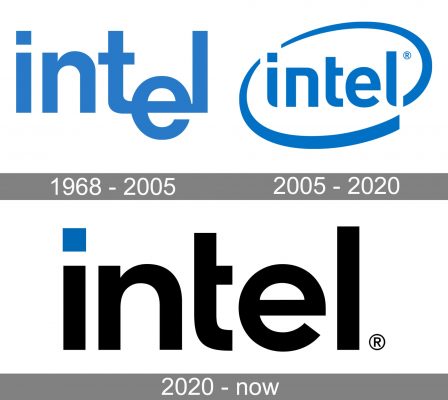
1968 — 2005

The original “dropped-e” logo was designed by Robert Noyce and Gordon Moore, who founded Intel. The blue insignia featured a clear sans-serif font. The “e” letter was placed lower than the “t” and “l”, thus looking as if it has “fallen” from the line. The emblem was used from 1968 until the end of 2005.
In the early 90s the Intel Inside logo was created, which was used parallel with the previous one. It was a part of a new marketing strategy. So as to make more consumers aware of the fact that there were Intel processors in their computers, the company created a special “Intel Inside” emblem. The logo created in 1991 included elements from the Intel Inside advertising campaign. At the same period the Intel jingle theme was created.
2005 — 2020
In 2005 the “swoosh” logo appeared comprising Intel’s new slogan “Leap Ahead”. The “e” letter got back to its place in the line, the font became more unique, and a “swoosh” appeared around the word “Intel”.
2020 — Today
The Intel logo has grown simpler due to the disappearance of the oval swoosh. Also, the rounded angles of the “i” and “l” became square. This added stability and helped to convey the “reliability” and “endurance” promise.
The “n” and “e” were also redrawn – they became broader and slightly changed their shape. For instance, the “n” has a more classic shape now.
On the whole, the subtle modifications we can see in the logo all point towards a single message, which can be interpreted as “traditional and reliable.” Apparently, the company decided to emphasize its heritage as an advantage it has over its competitors.
Sonic Emblem
In addition to the graphic emblem, Intel also has a sonic logo. To create the well-known xylophone/xylomarimba jingle the company commissioned Walter Werzowa, who used to be a member of the Edelweiss band. The jingle was produced by the Los Angeles-based music production company Musikvergnuegen. The audio mnemonic was modified in tone following the launch of Pentium 3, Pentium 4, and Core.
Font
The custom sans-serif typeface used in the emblem has several distinctive features. The “i” and the “l” characters both have a sharp end, while “i” also has a characteristic square on the top instead of a round dot. The bar in the “t” character is shorter than it is supposed to be.
Color
The light blue shade featured in the current version of the Intel logo symbolizes the company’s power in the minds of people. Unlike warm colors like red or orange, which conjure up emotions, blue “speaks” to a person’s intellect and conscience. Hardly a surprise it is often chosen to promote high-tech products and innovations connected with computers and the Internet. Also, blue symbolizes loyalty, wisdom, and tranquility. The other color used in the emblem, white, is basically just a negative background color. Yet, come to think of it, white has its own symbolic meaning, representing purity and nobility.


