Infosys is one of the largest Indian IT companies, which was established in 1981. Today the corporation operates worldwide and specializes in IT consulting and services.
What is the symbol of Infosys Limited?
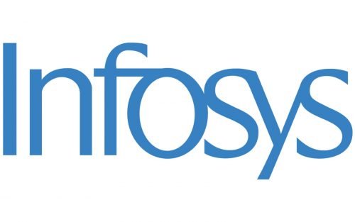
The symbol of Infosys Limited is its stylized logotype. The company decided not to use any graphical elements in its visual identity, making the clean contours and colors the main characteristics of the brand. The logotype is set in a custom font with elegant lines and connected characters, and the smooth and light shade of blue, used for its letters adds a sense of professionalism and protection.
Meaning and history
Infosys was founded in 1981 by N. R. Narayana Murthy and six other engineers in Pune, India. Initially focused on providing IT consulting services, the company quickly became a leader in the global IT outsourcing industry.
Infosys introduced the concept of offshore outsourcing to the U.S. and Europe, helping to shape the IT services sector. With its strong focus on innovation, it launched Infosys Technologies, offering software development and maintenance.
Today, Infosys is one of the largest IT services companies globally, with over 300,000 employees across 50 countries, continuing to drive digital transformation and innovation.
1981 – Today
The Infosys text-based logo is believed to have several hidden meanings, despite its visible simplicity.
The logo consists of an elegant sans-serif lettering, which is visually divided into three parts — “IN”, separated from the other letters, joint “F” and “O” and connected “SYS”.
The smooth lines make the inscription sophisticated and sleek. All the lowercase letters are enlarged and almost reach the size of the first capital “I”, which creates a balanced look of the logo.
The name of the company is a derivative from “Informational Systems”, so “In” may stand for “Informational” or “India”, to celebrate the company’s roots.
The connected “FO” resembles an Indian letter, which is the second in the company’s founder’s name and the first in his father’s name.
The “SYS” stands for “system”, and the way the letters are connected represents a “connected system”.
Another thing about the Infosys logo is its letter “O” in the middle. It resembles the Ashoka Chakra symbol from the Indian flag.
The calm blue color of the Infosys visual identity is a reflection of a professional and stable company, which values loyalty and is trustworthy and reliable.
Font and color
The modern minimalistic title case lettering from the primary badge of Infosys is set in a cool designer typeface with some of the characters connected to each other by the elongated bars, and some — just glued. The closest fonts to the one, used in this insignia, are, probably, OL Radiant Spender, or Stylette JNL, but with some significant modifications of the letters’ contours.
As for the color palette of the Infosys visual identity, it is based on a smooth and calm shade of blue, which stands for safety and reliability. This shade is often chosen for the logos of tech-connected companies and internet providers, as it reflects a sense of professionalism, transparency and trustworthiness.


