Hy-Vee is a supermarket chain in the Midwestern United States. Its commitment to employee ownership and community involvement distinguishes it from other supermarket chains. Most Hy-Vee stores are full-service supermarkets with bakeries, delis, banks, florists, and pharmacies. To keep up with Wal-Mart’s expansion into the gas station business, Hy-Vee has also added gas stations with convenience stores to some of its stores. Hy-Vee often engages in community health and wellness programs.
Meaning and history
The company was founded by Charles Hyde and David Vredenburg. They opened a general store in Beaconsfield, Iowa, in 1930. In 1938, the company changed its name to Hyde & Vredenburg, Inc. At the time, it had 15 stores in Iowa and Missouri. Hy-Vee was formally incorporated in 1952. Less than 10 years later, it introduced its employee stock ownership plan. The company has grown to become one of the largest supermarket chains in the region. There are more than 260 Hy-Vee supermarkets located primarily in Iowa. The company also has stores in several other states.
What is Hy-Vee?
Hy-Vee is a chain of stores that offer a wide variety of products, including groceries, pharmacy services, health and beauty items, and household goods. Many locations also feature additional services such as cafes, restaurants, and in-store dining options.
1952 – 1955
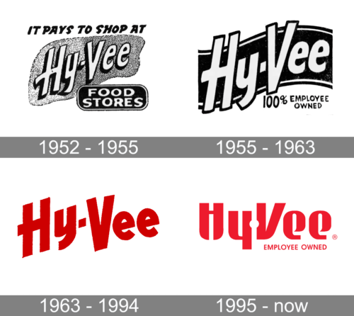
The logo from the 1950s is neither colorful nor exclusively designed. The brand name is printed using sentence case and bold, sans-serif typeface. The inscription also features a shadow on the left and a base that has an ambiguous shape. Above the name, the logo has a tagline “It pays to shop at”. In the lower right corner, there is a black box with rounded corners that has “Food Stores” printed in two lines. The logo turned out to be easy to read and quite informative.
1955 – 1963
The logo was updated a few years later and has a more professional design. The name is printed using the same font. It was slightly modified with cleaner lines and a thicker outline instead of a shadow. The base is now a black wavy ribbon with white lines at the top and the bottom. The higher contrast between the inscription and the background gives the logo a more professional appearance. All the other text was removed. Instead, the company added that it is “100% Employee Owned” in the bottom right corner using a basic, sans-serif font of black color.
1963 – 1994
In 1963, the company introduced its signature red color. The new, bold color palette as well as great brand recognition allowed the designer to remove all the other elements and leave just the name. The font is modern and slightly italicized, giving it a dynamic appearance. To give the inscription a different look, the letters are tilted to the left instead of the traditional right. Yet, it has a lot in common with the previous font.
1995 – Today
The updated logo has a smoother and more modern appearance. The strokes, though, have quite a high contrast. Instead of a dash, the logo features a white circle. Yet, it still remains quite recognizable thanks to bold strokes, sans-serif font, and red color. The company had brought back that the company is “Employee Owned”, adding this line in the lower right corner.
Font and Color
One of the earlier versions features a bold, sans-serif font similar to the Neumatic Gothic Bold Oblique font and Finland font. It looks somewhat handwritten. The taglines in the logo use a bold, sans-serif font with rounded strokes. The logo was slightly modified to look cleaner and more professional. The new font looks closer to a bold, condensed Filmotype Modern font with some modifications. The new font is bold, angular, and geometric font similar to a modified version of the Chopper Regular font.
During the initial years, the company used a traditional black-and-white color palette. It was not only appropriate for that time but also created an easy-to-read. Later, the company switched to a bold red with a white base. Red is a great eye-catching color that is also used by many companies to show their leadership and strength.


