HTC Corporation is a Taiwan-based consumer electronics manufacturer. In spite of its rather young age, the company is on top of its game. In 2011 HTC occupied the 98th line in the list of Best Global Brands provided by Interbrand. The company’s share on the world smartphone market rose from 3 to 7 percent between the fall of 2013 and spring 2015.
Meaning and history
HTC, or High Tech Computer Corp, is a world-renowned Taiwanese manufacturer of smartphones and tablets. The company started its business by developing the basic platform for PDAs, smartphones, and communicators. It also produced devices for such well-known companies as Hewlett-Packard, Dell, and Fujitsu.
Since 2001, the company widely used the strategy of creating different brands, among which were Qtek and Dopod, specializing in sales of the company’s products in the Asian region. Since 2006, HTC management decided to develop and produce its products under a single brand, HTC TM.
In 2010, the company ranked 31st in the world in terms of the number of innovative solutions it produced.In 2011 the corporation took 77th place in Forbes’ list of the world’s strongest brands.HTC actively cooperated with such giants as Microsoft and Google.
HTC is a member of the Open Handset Alliance, a group of phone manufacturers and mobile operators that promotes the Android mobile platform.
What is HTC?
HTC is the name of a Taiwanese telecommunication company, which was established in 1997, and today is one of the world’s leaders in its industry, having its laptops and consumer electronic devices distributed all over the globe. HTC is mostly known for its smartphones, laptops, and VR headsets.
1997 — 2006

The company was established in 1997. It specialized in making original equipment, mobile phones, tablets, and other devices from this group. Initially its smartphones used Windows Mobile as the base, but in the course of time HTC became one of the founders of the Open Handset Alliance, who created the Android system.
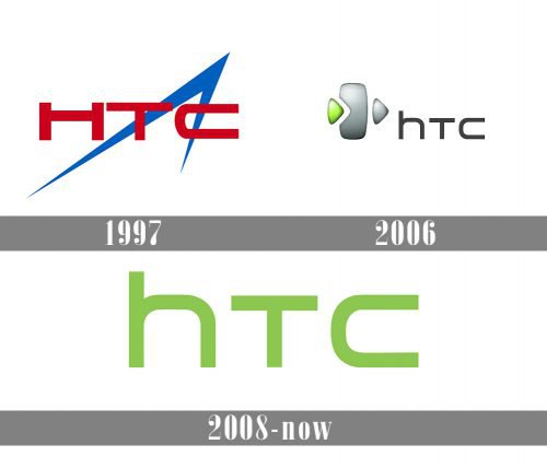
The original HTC logo looked nothing like the current one. The letters were red, and there was a stylized arrowhead in blue. The design was dynamic and sharp, yet, the overlapping elements in bright colors made it a little difficult to grasp.
2006 — 2008

The shape of the letters “T” and “C” has remained unchanged, while the “H” became lowercase. A rather complicated emblem appeared combining two triangles (resembling the “play” button) and a rectangle-based shape with rounded sides.
2008 — Today

HTC Corporation has a unique and original logo which is one of the most recognizable emblems in the digital arena. The company’s designers managed to create a logo that stands out in spite of the fact, that there’s not a single image, just letters.
Like many logos created not that long ago, the HTC logo is absolutely minimalistic. In the basic version, there’s nothing more than the company’s name in a rounded and modern customized font. However, that’s not the only version of the emblem. You may often encounter a version with the tagline “quietly brilliant” below the company’s name.
Colors

A bright, vivid shade of green is used for the HTC Logo. The color is associated with growth, freshness, youth, and nature. The “quietly brilliant” inscription at the bottom is made in black.
Font

From the first glance, the font seems rather simple. Basically, there are only three characters in a minimalistic sans-serif typeface. However, that’s not a regular font, but a customized one. Having a closer look at the insignia, you may notice that the “h” letter is small, while the “T”, that follows it, is capitalized. In spite of this, “T” is smaller than “h” in size, and due to these unusual proportions, the inscription looks fairly original.


