Logos have often been seen as something of a luxury instead of a necessity. Companies once attracted customers by default. But that’s not the case anymore. Today’s global markets, competitive businesses, and visually focused customers have made having a logo an imperative. Your logo is now one of the most crucial components of your business.
So how can this tiny thing make a world of difference to the success of your business? And how can you make your logo stand out from the crowd? Read on to find out how you can make your logo memorable for decades to come.

Know Your Brand
Before creating your own logo, you must know what your brand’s all about. Of course, you’re probably thinking you know your brand—it’s your business after all! However, you have to ensure that you know precisely what your business represents before creating your logo, and always look at the different logo ideas that pertain to your business.
To figure out what your business stands for, you first need to answer a number of questions about it. These include:
• Who exactly are you?
• What does your company stand for?
• What’s your company’s mission?
• Are you reliable and experienced?
• Are you low-cost/high-value or high-cost/high-quality
• How do your potential and existing customers view you?
• What are the features and benefits of your products/services?
• What qualities should potential customers expect from your company?
Once you answer these questions, you’ll be better placed to design a good logo. So, review your answers and ensure that they reflect what you want your company to be.
Simplicity Sells

Simplicity is a crucial aspect that all professional graphic designers advocate for in any logo design. Most people find a simple design attractive. They don’t have to interpret the logo to understand its purpose and meaning. The design itself relays the meaning because of its simplicity. The most recognizable logos today are perfect examples of simple designs.
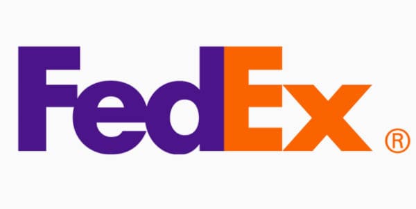
But simplicity is no excuse to create an ordinary logo. Instead, you should make the logo unique to arouse some kind of interest in your audience. Take a close look at the FedEx logo, for instance. It’s a simple logotype. Its white space has some kind of twist–an arrow between the letters ‘E’ and ‘x’—denoting speed, direction, and precision. Can you also be creative with your logo?

Also, look at the Amazon logo closely. It has an arrow that connects the letter ‘A’ to ‘Z’, meaning that the company has everything you need. The arrow is in the shape of a smile, which stands for the company’s happy customers. Design such simple logos that instantly catch the eye.
Use Fonts Wisely
Like colors and other design elements, font choice is another factor to consider when designing your logo. All typefaces come with a different nature and mood; therefore, they denote a totally unique and different meaning. Be sure to consider the typeface’s nature before including it in your design. Ensure it goes really well with the colors and theme.
Avoid using multiple fonts of a different family, otherwise, it’ll not deliver the message it’s supposed to. Be creative with fonts and avoid needless effects like semi-bold and bold as they can hurt the typeface’s personality. Keep your logo design stylish with relevant and crisp fonts and, finally, avoid decorative fonts if you don’t need them.
Choose the Right Colors
It’s essential to keep in mind that not only does color trigger reactions in an individual, it’s also perceived differently from person to person. This is why it’s imperative to figure out how you want your brand to be perceived. Knowing so will also help you cater to the tastes of your target market.
For example, red is energetic, exciting, and immediate. Consider why CNN, Pinterest, and Coca Cola are branded with red. Orange is warm, fun, and confident. Some brands that use orange in their logos include Home Depot, Nickelodeon, and Hooters.

Yellow is youthful, happy, and optimistic. Brands that use this color include Sonic, Best Buy, McDonald’s, Ikea, and many other food chains. Blue symbolizes loyalty and trust. It’s no surprise then that companies like American Express, Facebook, and PayPal use it as their main color.
Purple is creative, royal, and luxurious. Brands that use it include LA Lakers, FedEx, Hallmark, and Cadbury. Green symbolizes healthy, freshness, and growth. Some brands that use green include Animal Planet, Whole Foods, and Starbucks.
Black is rich, powerful, authoritative, and neutral. It’s used by brands like Nike, Adidas, World Wildlife Fund (WWF), and Wikipedia.
Be careful with how many colors you use, though. One general tip for logo design is not to use more than two or three colors.
Do Some Black and White Testing
Another important trait of an unforgettable logo is its potential to look dashing in black and white. Most logos are easy on the eye in colors, but many of them don’t have the same appeal when in black and white.
A logo is black and white in fax and photocopy documents, newspaper ads, stationeries, promotional products, billboard ads, and so on. This means that your design should be able to look effective in neutral colors, too.
Make the Most of White Space
When it comes to logo creation, white space can reinforce a design or message and make it stronger visually. The World Wildlife Fund (WWF) uses white space brilliantly, as does the outstanding FedEx logotype, which subtly shows a white arrow hidden within the lettering.

As our eyes tend to focus on more visible things, it might be difficult to design while keeping white space in mind. But if you can pull this off, it can definitely be good for your brand.
Create a Timeless Design
Many graphic designers tend to follow the latest design trends. While it’s natural for designers to experiment with the trends, it shouldn’t be an important factor in logo design. Your company’s logo is something you’d want to keep for decades. This is often because people develop some sort of emotional attachment to the symbols.
All of the leading brands know this power of logos. Their logos have stayed the same throughout the decades. They only redesign them when they look to rebuild their brand identity. In such cases, they simply modify the design a bit.
So, avoiding fall for the latest logo design trends so you don’t have to have your logo redesigned when the trends are over. Design a logo that remains attractive throughout the generations. It should be able to stand the test of time.
Design Something Flexible
When making your logo, bear in mind that it won’t remain on your screen eternally. Picture it on billboards, the top left corner of your web page, or in a brochure. Does it still stand out?
The ability to be resized and adapt to a variety of backgrounds are also factors you must consider. Complex designs don’t respond well to scaling down or up, which is why it’s essential to keep your design simple.
Design Something Unique
Since you don’t want your customers to confuse your brand with another company, it’s important to make your logo different from what’s already in the market.
Resist the temptation to imitate another logo you like. Instead, find ways to make your design totally unique to your industry and convey your brand message. Also, one that won’t breach another company’s trademark.
This is why it’s recommended that you hire a professional graphic designer to make you a unique logo. And don’t use any of the many online logo makers that some low cost and inexperienced designers use.
Having your logo professionally designed is one of the best investment decisions you can make in your business. It’s something you’ll use for eons on your products, websites, social media, stationery, and so on. It’ll also help you firmly establish your brand in the minds of potential customers.
The Bottom Line
While there aren’t any hard and fast rules for logo design, the world’s leading designers and brands adhere to the above principles when it comes to creating a logo and developing a brand identity. It’s our hope that we’ve shared useful tips that’ll help you put together a logo that’s not only simple and flexible but also most importantly memorable.


