The logo of the Chinese budget technology brand Honor has a definite tech feel about it. Due to its rounded and sleek shapes, it looks minimalistic and modern (even futuristic).
Meaning and history

Honor is a sub-brand of the Chinese corporation Huawei. While Honor was officially founded in 2013, the project was actually conceived in late 2011. Today, the brand manufactures a variety of products, from smartphones and tablet computers to wearable technology.
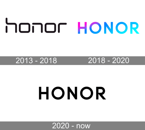
2013 – 2018

The old Honor logo features the name of the brand in lowercase letters. All the letters are based on a square shape and have rounded corners and ends. The “h” and “n” have distinctive white gaps breaking each of the glyphs into two parts. The “r” looks somewhat unusual due to the lack of the top left end.
While in most cases, the word “honor” was used as a logo in itself, the emblem could also have a more complex look and include an additional text message. For instance, you could come across the logos comprising lettering “For the brave” and “Powered by Huawei” below the name of the brand.
2018 – 2020

The company revolutionized its brand identity. Not only was a new type introduced, but the palette was also changed.
The smooth lowercase typeface with rectangular “o’s” was replaced by a more traditional one, where the letters were capitalized, and the “o’s” had a classic circular shape. However, the wordmark still looked more angular than its predecessor, thus conveying the “reliability” message.
2020 – Today
The company decided to follow modern trends and made the logo minimalistic, clean, and polished. To preserve brand recognition, the company kept the font unchanged. The colorful color palette was replaced by a classic, formal black. It made the company look more serious and trustworthy. The black is a powerful, elegant, and luxurious color.
Colors
Typically, the Honor logo is given in light blue over the white background. The black emblem is almost as popular, while other colors can be used occasionally.


