The Head & Shoulders logo has gone through at least five updates since the product was introduced.
Meaning and history
The creation of a new shampoo, whose action is directed against dandruff, began in 1950, but it took about 10 years to create a new formula. The active ingredient used was zinc pyrithione. The ultra strong version of the shampoo uses another active ingredient – selenium sulfide, In November 1961 Head & Shoulders shampoo appeared on the American market.
Procter&Gamble scientists later developed a unique particle form that enhances the effectiveness of zinc pyrithione. The ultra strong modification of the shampoo used another active ingredient – selenium sulfide. This helped to create the Actizinc complex available in all Head & Shoulders products.
What is Head & Shoulders?
Head & Shoulders is the name of one of the most famous brands of shampoo and hair care cosmetics, established in the United States in 1961. Today the brand is owned by Procter & Gamble, and its products can be found in dozens of countries across the globe.
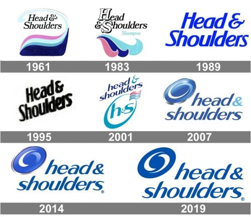
1961
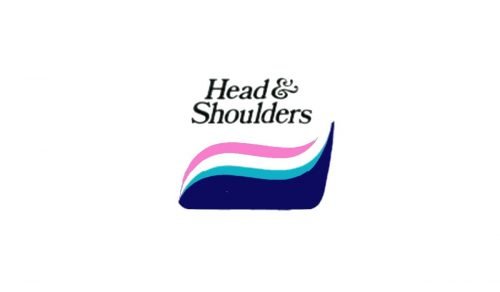
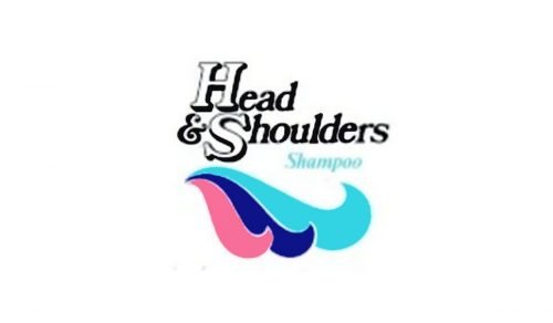
In addition to the name of the brand in an italicized serif type, there was a wavy design in pink and three shades of blue.
1983
The wave was modified. There were now three parts (two blue waves and a pink one).
1989
The wave disappeared, the lettering grew simpler and was now colored solid blue.
1995
The lettering adopted an upward direction.
2001
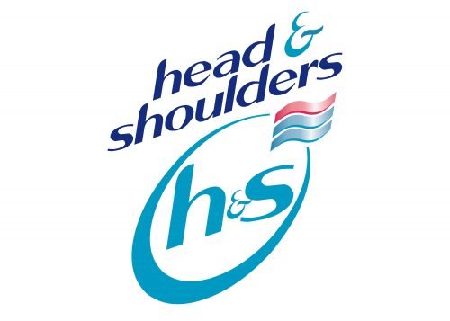
The type grew simpler. An “H&S” emblem was added.
2007
The era of a swirl logo started. In 2014 and 2019 the company introduced slightly modified versions of the swirl.
2019

The redesign 2019 has flattened the combination of an emblem and the lettering from the Head & Shoulders badge, switching the color palette to medium-blue and white, and refining the contours of all elements. The badge started looking more professional and laconic, with the swirl simplified.
Font and Color
The bold and smooth lowercase lettering from the primary Head & Shoulders logo is set in an italicized sans-serif typeface with softened cuts of the lines. The closest fonts to the one, used in this insignia, are, probably, Todes Medium Italic, or Cabrito Contrast Ext Black It, but with significant modifications of the characters’ contours.
As for the color palette of the Head & Shoulders visual identity, it is based on a fresh and clean combination of blue and white, which brilliantly represents the purpose of the brand, and evokes a sense of professionalism and confidence.


