HDFC Life is among India’s largest life insurance companies. It provides various individual and group insurance solutions. It is headquartered in Mumbai. The brand is a joint venture between HDFC, which is a housing finance provider, and investment company Standard Life Aberdeen.
Meaning and history
HDFC Life is one of the few companies that are exceptionally consistent in their brand identity. The two decades of using exactly the same logo speak for themselves.
What is HDFC Life
Founded in 2000, HDFC Life is the first private sector life insurance company in India. It markets its polices using a wide network of insurance agents, Bancassurance partners, insurance brokers, etc.
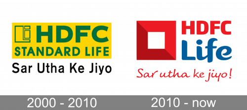
2000 – 2010
The 2000 design featured a yellow rectangle with green contents: a big ‘HDFC’ acronym, the ‘Standard Life’ inscription below, as well as an array of geometric shapes in the corner. Besides, there was also a motto in Hindi written in basic, black letters beneath the main logo, which translates to ‘keep your head up’ in English.
2000 – present
The HDFC Life logo is remarkable for its clean, bright palette. The colors create an upbeat, inspiring impression, which is partly supported by the shape of the elements.
The design can be broken down into three parts: the emblem, the wordmark, and the tagline.
The emblem is a thick red square with a white filling. The most obvious interpretation is that the red part is a sort of fence or compound wall symbolizing protection provided for the customers. The thickness of the walls implies a high level of protection.
The “reliability” theme is supported by the type used for the lettering “HDFC,” which can be seen to the right. While the glyphs aren’t of course as thick as the “fence,” they look rather solid connoting stability and reliability. Then again, the designers who worked on the logo haven’t gone overboard in trying to convey these qualities. Otherwise, we would see a squat wordmark.
Conversely, due to the moderate thickness, the lettering “HDFC” doesn’t look out of place next to the rather casual script used for the word “Life.” While the two parts of the company’s name use dramatically different typefaces, there is still some kind of harmony between them. It is partly due to the fact that the glyphs in “HDFC” are not too heavy and that they are softened by a slight variation in the thickness of the lines.
In the word “Life” the thickness of the lines varies to a greater extent, of course. The last three letters effectively look like handwritten ones. Such a move reflects the company’s strive to convey the idea of an individual approach. So, while the “L” is more about the “stability” theme and looks more like the lettering “HDFC,” the “ife” introduces a “personal” theme. Also, these slightly casual strokes convey the feeling of being relaxed and laid-back.
This theme is emphasized in the tagline of the HDFC Life logo. This is where the “laid-back” and “casual” notions are reflected most obviously. The tagline features a cursive script imitating handwriting. It’s like a note, a promise written personally for you by the company’s top executives.
Colors and font
The vivid red of the emblem captures your attention and is highly visible even at longer distances. The darker, calmer blue used for the word “Life” balances the red. As a result, the logo doesn’t look overtly aggressive.
The combination of three different typefaces makes the HDFC Life logo unique. The most remarkable thing is how the three merge, which includes the gradation from the “serious” one at the top to the “laid-back” one in the lowest part of the design. The combination of the two qualities reflects the main promise behind the logo, which is “you can be relaxed and optimistic, when you’re under our protection.”


