Groupama (Groupe des Assurances Mutuelles Agricoles) is a French insurer working in over ten countries. The company’s roots can be traced as far back as to late 1840, when farmers in Mions (Rhône) founded the first local agricultural mutual fire insurer. It was a mutual organization aimed at fulfilling the farmers’ very specific insurance needs. It was, however, only in 1986 that the brand Groupama was introduced.
Meaning and history
Despite all the updates the Groupama logo has gone through in its more than 35-year history, you can still notice a couple of recurrent motifs.
What is Groupama
Groupama is an insurance group based in Paris, France. At one point in its history, back in 2005, it was ranked sixth by annual turnover, which made the group the second-largest mutual insurer in the world. The company was formed as a result of the merger of three insurers, namely AMA Samda, Soravie, and Sorema.
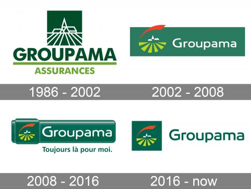
1986 – 2002
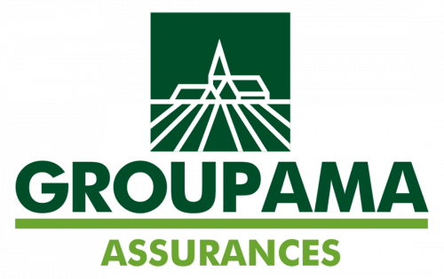
The earliest logo showcases a peaceful pastoral scene. The bucolic idyll includes perfectly regular furrows of a plowed field and small houses on the horizon. Judging by the roof of the tallest dwelling, it’s not just a farmer’s house but more of an administrative building.
The emblem is a clear allusion to what the company refers to as its early history (the insurance fund created by farmers in Mions). The dark green box, which serves as the background, only reinforces the “rural” theme and is but one more reference to the same story.
Moving down, we can see the name of the brand in a clean sans serif type, which offers excellent legibility.
Below, there is the lettering “Assurances,” which, in translations from French, means “Insurance.” This kind of explanatory text was useful during the first years the company worked under this brand as neither the name nor the emblem shed any light on the type of products or services on offer. However, to show that the word “Assurances” doesn’t belong to the name of the brand, the designers colored it in a lighter shade of green and separated it by a horizontal bar.
2002 – 2008
The second version of the Groupama logo had a more modern look. The rural buildings were made smaller. So much so that you wouldn’t be able to decipher what these elements meant unless you had seen the previous logo or had been told about the meaning of the emblem. Also, the regular farrows of a plowed field now looked more like the rays of the sun, the similarity being reinforced by the light color.
There was a red swoosh above, which added a dynamic accent.
The emblem was positioned to the left of the wordmark, which was now set in white. Both the parts of the logo were housed inside a dark green rectangle.
2008 – 2016
The designers added some depth with the help of the gradient. Also, they made the emblem smaller, whereas the wordmark grew larger, thus providing better legibility.
2016 – present
Now, only the emblem has a dark background, whereas the wordmark is green on a white background.
Groupama Group
The corporate logo is a simplified rendition of the main brand’s logo. Here, the rising sun allusion is emphasized. That’s because the “rays” (or farrows) are positioned not below, but above the wordmark. While this approach eliminates the agricultural theme, it strengthens the optimistic mood of the emblem and the promise of a bright future for its customers.
Colors and font
In addition to alluding to rural life, green, which is the color of dark leaves in deep shade, looks very calm, natural, and relaxing. All these are great connotations for an insurance company.
Simple as it is, the type in the Groupama logo has a unique touch and offers adequate legibility.


