Globe Telecom, Inc. (better known as Globe) is a large provider of telecommunications services in the Philippines.
Meaning and history
GLO was incorporated in 1935 under the name of Globe Wireless Limited. It was later renamed Globe-Mackay Cable and Radio Corporation and received its current name in 1992.
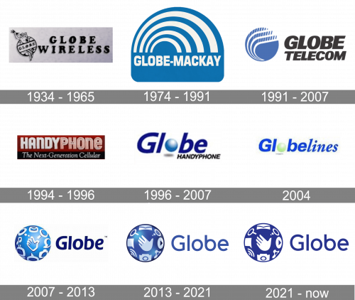
1934 – 1965
The original logo used the full name (then – ‘Globe Wireless’) on the right, written in capital serif letters. On its left was their emblem – a picture of the globe with the word ‘Globe’ written across it in the same style as in the name. Behind it, they’ve also put Zeus with three lightning bolts in his hand.
1974 – 1991
If you compare the company’s emblem of the Globe Mackay era with the current Globe logo, you may notice an interesting fact. Although they are pretty different, they both use a palette dominated by blue and a circle theme (inspired by the name “Globe). Here, this theme is represented by multiple arches.
1991 – 2007
After the brand adopted its current name, it introduced a new logo, where the globe theme was implemented literally. You could see a blue circle with a rich white swirl. The swirl was inspired by the signals that carry the information in telecommunications.
1994 – 1996

The 1994 emblem was a rectangle divided into two color sections: the black third below and two red thirds above. The former held the words ‘The Next-Generation Cellular’ in white cursive writing, while the latter had a ‘Handy Phone’ wordmark (their then-name) written in bigger, white sans-serif letters.
1996 – 2007
The circle adopted a light blue shade (with the white gradient) and replaced the letter “o.” The type grew lighter both in terms of its weight and color.
2004
In the version used for Landline, the designers made the design more vivid. The blue grew brighter, while the globe was colored light green.
2007 – 2013
Once again, the circle became large. The symbol nicknamed Globe Life showcased a hand icon surrounded by several icons. According to the company, the icons features the objects involved in the telecommunications industry:
- the envelope symbolized text messages
- the loupe symbolized internet browsing
- the cam and the note symbolized MMS
- the computer was used as a symbol of the internet businesses
The lettering grew darker. Also, it appeared that the wordmark wasn’t italicized anymore (although in fact, the letters weren’t 100% straight).
2013 – 2021
Having preserved its structure, the Globe logo was enriched by the following icons:
- speech bubble
- transmitter (circle) to symbolize wireless internet connections
- circles and round bars connecting them (social media)
- play button (multimedia entertainment)
2021 – Today
In 2021, they removed all the lighting effects from the logo, tweaked the colors to the same dark blue shade and got rid of the black frame around the globe.


