Over its more than 115-year history, the logo of the French cosmetics brand Garnier has been growing more meaningful.
Meaning and history
Garnier is a well-known beauty and personal care brand that was founded by Alfred Amour Garnier in 1904. Since its inception, Garnier has made significant achievements in the industry. One of its notable accomplishments includes the development of innovative products infused with natural ingredients to enhance hair and skin health. The brand has also been dedicated to promoting sustainability by implementing eco-friendly practices in its manufacturing processes and packaging. Garnier has successfully expanded its product line to include a wide range of skincare, haircare, and hair color products, catering to diverse consumer needs. Currently, Garnier continues to be a leading brand in the beauty industry, offering effective and affordable solutions while prioritizing sustainability and environmental responsibility.
What is Garnier?
Garnier is a renowned beauty brand that offers a wide range of skincare and haircare products. Known for its innovative formulas and affordable prices, Garnier aims to provide effective and accessible beauty solutions for people around the world.
1884 – 1904
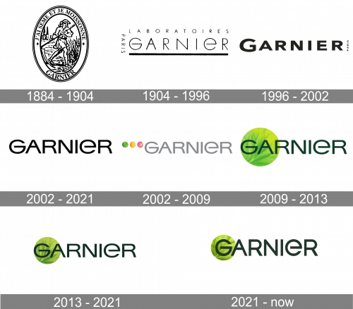
The very first Garnier logo was created in 1884 and stayed with the cosmetic company for twenty years. It was a traditional badge in the oval shape, vertically oriented, with the image enclosed into a pretty wide frame where the lettering was written around the perimeter. The name of the brand was set in all capitals of an elegant serif font along the bottom part of the frame, while the upper part comprised the “J’ai Seme Et Je Moissonne” inscription in French, which can be translated as “I Saw and I Reap”. The motto was separated from the name by two solid black dots. As for the main part of the medallion, the image featured the drawing of a woman with a scythe in a field. The whole badge was executed in black and white.
1904 – 1996
The original Garnier logo was pretty cluttered and not very legible. In addition to the name of the brand in a very thin type, there was the lettering “Laboratories Paris” in tiny letters.
1996 – 2002
The type grew bolder and better legible, although the word “Paris” was still impossible to make out at smaller sizes.
2002 – 2021
 The Garnier badge introduced in 2002 boasted the iconic logotype in the custom typeface, which was being used on all the logo versions up to 2021. It was a simple yet powerful black inscription in the uppercase, with bold lines and unique silhouettes of the letters, and the open contour of the lowercase “E”.
2002 – 2009
The company dropped the word “Paris” and opted for a lighter but larger type. The wordmark could be given not only in black but also in gray. You could see three roundels (green, yellow, and pink), each with a meaningful image inside.
2009 – 2013
The green circle featuring a leaf pattern has grown larger and moved behind the wordmark.
2013 – 2021
 With the redesign of 2013 the circular emblem with the leaf pattern became a bit smaller and got its color refined, so now looked more natural and calm. The shades of green got darker. Now the circle was overlapped by only two first letters of the inscription. As for the lettering part, it remained untouched but due to the change of hues in the graphical part, the logotype also looked a bit darker now.
2021 – Today
 In 2021 the Garnier logo gets redesigned again. And this is the first time since 2002 when the changes were made to the iconic typeface of the brand’s logotype. The letters became bolder and the contours got more traditional and strong. Although the lowercase “E” with its open contour is still there, the style of all the symbols in the inscription was changed and the letters got slightly condensed and stretched vertically. As for the graphical part of the badge, it is now set behind the “G” and features a lighter and more distinctive leaf pattern.
Font and color
The light and elegant Garnier logotype evoke a sense of confidence and expertise with its extended clean Sans-serif letters, and the “E” is the only lowercase one, among all caps. The custom typeface of the Garnier wordmark was designed exclusively for the brand but looks pretty similar to such traditional fonts as Heading Pro Ultra Wide Regular and Europa Grotesk SB Extd, but with some lines and contours modified.
The green color palette of the Garnier logo is based on a dark shade for the lettering, and light gradient tones for its leaf-emblem. The combination of different shades of green makes the logo delightful and memorable and reflects the brand’s focus on natural ingredients, the value of health, and high quality.


