Fructis is a label of haircare and styling products of the Garnier brand, which is part of the L’Oreal Group. The brand was established in 1904 and today is one of the biggest brands of the group, selling its products across the globe.
Meaning and history
The popular brand got its name due to the addition of fruit extracts to the products’ formulas, it had to show the plant-based composition of the company’s shampoos and other hair care cosmetics, which give a long-lasting effect for the hair.
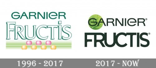
The company’s logo is composed of a wordmark, consisting of two parts — the mother brand, Garnier, inscription on top of the “Fructis” lettering. The brand’s visual identity was always consistent and had only one major redesign during the company’s history, which took place in 2017.
Until 2017
The original Fructis logo was text-based, as the current one. But there was also a colorful underline, composed of two thick horizontal lines, and each of them contained a few spheres — the upper one had three pink ones and the bottom one had four yellows. It was a graphical representation of the hair follicles, getting strengthen by the fruit shampoo molecules.
The color palette of the original shampoo’s logo was based on green and white, colors that symbolize growth, natural energy, and balance.
Font
The brand’s wordmark is split into two parts — the upper one with a solid “Garnier” inscription in all capitals, which is executed in a sleek sans-serif typeface, which is very similar to Heading Pro Ultra Wide Book. The letters “G” and “E” have the same silhouettes, just upside-down. The horizontal bar of the “A” is placed a little higher than usual, which makes the nameplate unique and memorable.
The Fructis inscription is also written in all capitals except for “I”, and with the “F” enlarged. The lettering is executed in a bold serif font, close to Kertayasa Outline typeface, with white thick bodies of the letterforms and a thin green outline, with a green shadow.
The brand’s nameplate looks balanced and bright due to the use of two different typefaces and sizes of the letters. It is neat and clean, with distinct lines and enough space.
After 2017
The redesign of 2017 brought a more modern look to the Fructis logo. Now the logo uses one dark green or black color for all lettering, which adds harmony and makes the visual identity whole and complete.
The only graphical element on the brand’s logo is a fresh green circle around the letters “G” and “A” of “Garnier”, which is a symbol of the company, which produces mostly plant-based cosmetics. The emblem makes the brand’s image crispy and friendly, evoking a sense of responsibility and trustworthiness.
Font
The Garnier part of the wordmark hasn’t changed much, its capital letters are still written in a company’s signature sans-serif, similar to Heading Pro Ultra Wide Regular font, which is solid and confident, looking contemporary and strong.
As for the “Fructis” inscription, the only thing that was left from the previous version — it is executed in all capitals and is bigger than the “Garnier” part. At the beginning of the redesign campaign, the brand used Helvetica ultra compressed typeface for the lettering, but later it was changed to a more modern and eye-catching font, which is similar to a modified Sonika Bold, where the bottom bar of the “F” is shortened and all the letters are connected to each other.
The current wordmark looks smooth and sleek, it reflects the strong and contemporary brand, which values progress and innovations and aims to provide their customers with the best products possible.
Review
Garnier Fructis brand is known all over the world. You can see its products on the shelves of almost any supermarket chain and in small corner stores. The brand is known for its wide variety of hair care and styling products, which are available at low prices.
The product range includes shampoos and conditioners, suitable for different types of hair, several kinds of styling products and hair color items for diverse needs. The brand is positioned like a manufacturer of semi-professional cosmetics for home use.
The company’s products are based on the patented Active Fruit Protein formula, which contains natural extracts, vitamins and citrus protein, which help the hair be stronger and healthier, adding them shine and silky texture.
The brand is known and loved worldwide, and its bright packaging, which varies from one type of product to another, is eye-catching and makes the shampoo and conditioner bottles stand out on the shelves.


