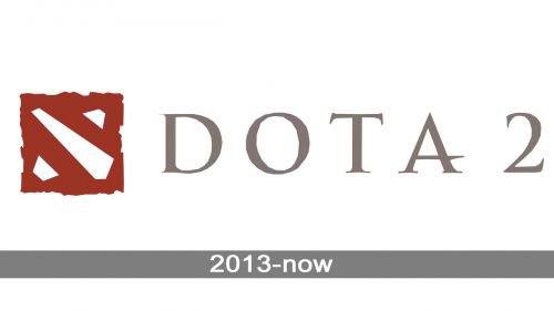
One of the most globally popular multiplayer video games, Dota 2 has a distinctive and somewhat intriguing logo. Those people who are familiar with the game, though, will decipher the Dota 2 logo as a matter of seconds.
Meaning and history
The history of the Dota series started in 2003 when Defense of the Ancients was released. Several months later, The Frozen Throne was released, and the two games started their competition for success.
A holding company named DotA-Allstars, LLC., was created by Steve Mescon and Steve Feak. In 2005, Feak left the company, while a person nicknamed IceFrog became its lead designer. Meanwhile, Defense of the Ancients was already very high in the rankings of the world’s most popular mods.
At this point, several employees of the US game developer Valve Corporation became avid fans of Defense of the Ancients. Headed by IceFrog, with whom Valve Corporation signed a contract, they started their work on a modern sequel in 2009. Dota 2 was officially announced in 2010. The name of the game was the abbreviation of “Defense of the Ancients.”
The game was unveiled at Gamescom in 2011 as a closed beta version. In September, it was moved to the open beta state. The official release took place in the summer of 2013. Valve Corporation had various issues with local economic legislation in several parts of the world (i.e., China, South Korea), but most problems were solved by selling the rights for the game to local companies.
Late in 2016, a new gameplay version 7.00 was unveiled. Two years later, the company decided to introduce small updates every two weeks in the form of the “Dota Plus” subscription system.
2013 – Today
Basically, the logo is nothing more than a map. The longer element in the middle is the river. At the top right corner, a Scorch/Dire base can be seen. On the other side of the river, there’s the Radiant/Sentinel base. All these are placed inside something that looks like a metal plate, a piece of paper or textile. The uneven ends create an impression of old and heavily used material.
While many gamers have been looking for a deeper meaning to the logo, it appears they haven’t discovered much on the topic.
The Dota 2 logo has remained mostly unchanged ever since it was introduced, so we can hardly talk about evolution, in this case. If you compare it with the emblem of its predecessor, Defense of the Ancients (DotA), you will see it’s just a completely new logotype created from scratch.
However, you may come across several slightly different versions of one of the Dota 2 emblem: in slightly lighter or darker hues, with or without the gradient, etc. All these are not different emblems but just versions of the primary one. They exist at the same time and are interchangeable. The choice depends on the background, visual context, and other circumstances.
Icon
The Dota 2 icon is a calm red square with uneven edges, placed on a white background and accompanied by medium gray lettering under it. The “Dota 2” wordmark is set in the uppercase and executed in a custom and elegant typeface with the horizontal bar of the “A” elongated to the right.
As for the red square, it has three cutouts, with the edges in a brighter shade of red. The white cut-out elements (one in the bottom left corner, one diagonal in the middle, and another in the upper right corner) for a symbol resembling a diagonal cross, or a letter “X”.
Font
The Dota 2 logo appears to use a custom or at least customized typeface. The most distinctive letter is arguably the “A.” Its middle bar is extended to the right and placed somewhat lower than in a regular “A,” which creates an unusual impression.
While the unique details on the other glyphs aren’t so obvious, you can still notice them at larger sizes. All the glyphs, except the “O,” have unique serifs. Their elaborate style conjures up images of medieval kings and knights.
Colors
The plate, which constitutes the primary logo, features several shades of red. The gradient effect helps to add some depth. Through the holes, the black background is visible. When the emblem is given next to the wordmark, both of them have a black background. The wordmark is colored in shades of grey and beige. The overall effect of the colors used on the emblem is rather dark, with low contrast.


