Discover is a credit card brand used mostly in the US. The majority of the cards with this brand are issued by Discover Bank, which belongs to and is operated by Discover Financial Services.
Meaning and history
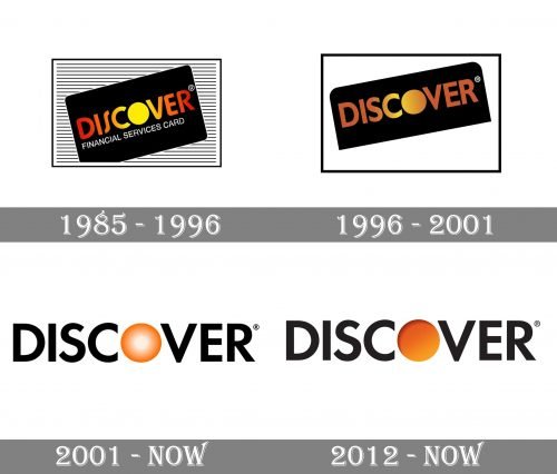
The Discover logo is an example of a gradual evolution when the design is updated without losing the links to its heritage (and loyal customers).
1985
Sears, a US chain of department stores, introduced the Discover card in 1985. At the time, Sears was the largest retailer in the country.
The original card was black. It showcased the word “Discover” in various shades of orange and red. The central “O” was a yellow circle resembling the sun, while the filling of the other letters looked like the fading colors of the sun during the sunset. The gradient went from yellow in the glyphs closest to the “O” to red in the initial and final letters. The palette looked impressive on the black background.
The writing “Financial Services Card” in a smaller all-caps type below slightly spoiled the impression, however.
The typeface combined rather sharp ends with softly rounded angles of the letters. The most unusual letter was probably the “S,” which seemed to have been squeezed between its neighbors with effort.
1996
The designers made the palette of the Discover Card logo nobler by adding a slightly muted gold/brownish nuance. They had to sacrifice the poetic similarity with the sunset. Instead, they introduced the gold (“status”) theme, which appeared highly appropriate for a credit card.
At first sight, the typeface could have looked the same but a side-by-side comparison showed several modifications. The letters adopted sharp rectangular ends, which looked more stable (and thus, conveyed financial stability). The “S” got more space and started to look more generic.
2001
The logo now featured black letters on a white background. Only the central “O” preserved its original golden theme (in fact, there was more “sun” than “gold” already). The letter featured the gradient moving from the white center to the bright orange edge.
There was also a flat version, where you could see the orange “O” without the gradient.
2012
The designers made the orange of the “O” more saturated. The center of the letter is now not white but orange. While the gradient is still there, it is less noticeable – it’s just a subtle shift between the yellowy tones in the lower right part of the circle and the brownish top.
On the acceptance mark, the Discover logo is paired with an orange corner. The colored corner has a subtly curved border.


