The Deutsche Post brand belongs to the world’s largest courier company Deutsche Post DHL Group. The company states that DHL, which is its Express division, operates in more than 220 countries and territories. The brand’s roots can be traced to Deutsche Bundespost. It was established in 1947 by the German government as a postal service and telecommunications business.
Meaning and history
In spite of the multiple updates the Deutsche Post logo has experienced over its long history, it has preserved some of its visual heritage.
What is Deutsche Post
Deutsche Post is a brand used for local mail services in Germany by Deutsche Post AG. The latter is the package delivery and supply chain management company based in Bonn. While about 20% of the company’s shares belong to the state, the rest is freely floating.
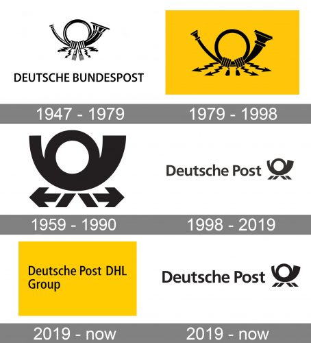
1947 – 1979 (Deutsche Bundespost, West Germany)
The original logo already showcased the post horn, which has been a key part of the visual brand identity ever since. The post horn is a very popular symbol used by postal companies in many countries. This instrument has a long history. It has been extensively used by postilions of the 18th and 19th centuries to signal the arrival or departure of a post rider or mail coach.
In the logo, the horn looked pretty realistic, with white highlights and decorations. The name of the company was below. It featured a clean sans serif typeface.
1979 – 1998 (Deutsche Bundespost, West Germany)
The image was redrawn. It became simpler, easier to grasp. It was a symbol of the postal horn rather than a realistic depiction of this instrument, like in the previous logo. Instead of the decorations, two black stripes appeared, and there were also two arrows to symbolize speed.
1959 – 1990 (Deutsche Post, East Germany)
The state postal services company of East Germany used the same approach as the designers of the original logo of its West German counterpart. While the horn doesn’t look exactly the same, it is also rather realistic and includes decorations and even lightning bolts.
This was the first time when a saturated yellow rectangle was added as the background for the logo.
1998 – 2019 (Deutsche Post AG)
In the summer of 1989, the Bundepost went through reform and was divided into three divisions. The postal services were now provided by the division called Deutsche Bundespost Postdienst. In early 1995, the postal division was privatized and renamed the Deutsche Post AG.
The visual brand identity combined elements of both the predecessors. On the one hand, the yellow background was taken from the logo of the East German postal company Deutsche Post. On the other hand, the simple horn with minimum details looked the same as the one in the logo of the West German postal company Deutsche Bundespost.
The wordmarks featured the Frutiger typeface.
2019 – present: corporate logo
The Frutiger typeface was replaced by a custom font created specifically for the company and named Delivery.
In the corporate Deutsche Bundespost logo, there is only the lettering “Deutsche Bundespost DHL Group” over the yellow background.
2019 – present: brand’s logo
In the brand’s logo, the words “DHL Group” are replaced with the same stylized postal horn as the one in the 1998 version.
Colors and font
The black and yellow palette that has been characteristic of the Deutsche Bundespost logo was introduced in 1959–1990 in the emblem of Deutsche Post, East Germany.
Over the last two decades, the company used fonts named Frutiger (1998) and Delivery (2019).


