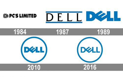
The original Dell logo created in 1984 featured the company name in a simple serif font. Five years later, the iconic “slanted E” emblem appeared. According to the company, it was a visual representation of Michael Dell’s wish to “turn the world on its ear”. The emblem featured solid letters in dark blue color.
The next logo update took place in 2010, when a circular outline appeared around the wordmark. In 2016, following the merger with EMC Corporation, Dell modified its logotype once again. The typeface acquired a thinner look. However, the very shape of the letters, including the slanted “E” stayed unchanged.
Meaning and History
The visual identity history of Del has been pretty constant from the end of the 1980s, but before the company used two different versions of the logo, and the very first was designed for PC’s Limited, the original name of Dell, established in 1984.
1984 — 1987
The initial logo, created for PC’s Limited, featured a bold black logotype in all capitals, executed in a narrowed sans-serif typeface with very thick lines of the letters. The wordmark was placed on the right from an abstract geometric emblem, consisting of a square figure formed by numerous black lines. The monochrome color palette of the company’s visual identity made it look strong and professional, reflecting the purpose and essence of the brand.
1987 — 1991
The company was renamed Dell three years after its establishment and this is when the new logo was adopted. The elegant capitalized logotype in black was executed in a fancy serif typeface and placed between two blue horizontal lines. It was simple yet sophisticated and professional and looked bright and cool due to its new color palette.
1989 — 2018
The intense blue color became the main one in the Dell color palette with the redesign of 1989. The new emblem, designed by Siegel+Gale design bureau, featured a bold sans-serif logotype with the letter “E” placed diagonally, inclined to the left. This badge became iconic and was in use by the company until 2018, though even today the brand has its modified version as the primary one.
2010 — 2016
The iconic blue logotype executed in Futura Extra Bold font was enclosed in a circular frame, drawn in the same shade of blue. The new figure balanced the sharp and strict look of the letter-lines and made the image more stylish and smooth. There were some minor changes done to the inscription itself: more space was added between two “L”s and the lines of the wordmark became a bit thinner.
2016 — Today
The De logo was redesigned again in 2016 to celebrate the company’s merger with EMC. The color palette and style of the iconic logo remained untouched, though the typeface was changed to a more lightweight one, with thin straight lines, and it made the brand’s logo fresher and crispier, with more white color in it, the badge started evoking a sense of reliability and loyalty.


