

![]() Daily Mail Logo PNG
Daily Mail Logo PNG
The Daily Mail is a British newspaper that is known for its coverage of various topics. These include politics, current events, celebrity gossip, and other popular stories. It gained recognition for its distinctive style, which often includes bold headlines and a focus on emotive content. The newspaper adapted to the changing world, developing a strong online presence in addition to having a large base of print paper readers.
Meaning and History
![]()
The British newspaper was first published in 1896 by Alfred Harmsworth (Lord Northcliffe) along with his brother Harold Harmsworth. Its relatively cheap price helped it reach a broad audience. The paper quickly gained a large circulation, becoming one of the most popular newspapers in the UK. The Daily Mail took strong political positions in the 1930s and 1940s. During World War II, the newspaper was known for its patriotic stance. The paper continued to evolve, adapting to changing social norms and tastes in journalism. The newspaper has been managed by the Daily Mail and General Trust (DMGT) since 1922. Throughout the years, it continued to expand its reach and influence, both in print and online.
What is Daily Mail?
The Daily Mail is one of the British most widely read newspapers. The publication has been subject to criticism over the years for its controversial reporting and editorial choices. Nonetheless, it played a significant role in the development of tabloid journalism in the country.
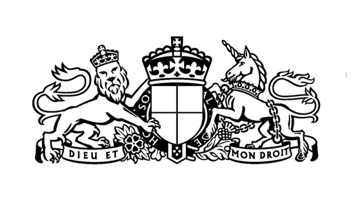
1896 – 1916
![]()
The logo of the newspaper combines the name and intricate design element. The inscription is done using a Gothic font. It features a combination of uppercase and lowercase, contributing to a classic and recognizable appearance. The swirls not only create a feeling of movement and dynamism but also hint at interesting stories with unexpected turns. As for the emblem, which was set in the center, it has a lion on the left and a horse on the right. Both animals are strong and impressive.
1916 – 1958
![]()
The logo has not changed much since the foundation. It was decided to do away with the image in the center. Instead, the newspaper added “The” article in front of its name. This gave it a confident look and showed that everyone was familiar with this newspaper. The font remained the same, although there was no double-line effect seen earlier.
1958 – Today
![]()
The design remains traditional and evokes a sense of reliability, which aligns with the newspaper’s long history in journalism. It was decided to bring the emblem with the lion and the horse. The new version looks lighter and is more elongated. As for the font, it features bolder lines and no longer has decorative thin strokes. The overall look is clean and professional, making it easily identifiable with a recognizable image while giving it a more modern spin.
Font and Color
The Daily Mail logo features a distinctive font that is bold and slightly italicized, giving it a sense of grandness. The original logo as well as a subsequent version uses a font that is very similar to Luke Medium200 by The Northern Block and Avebury Inline by Parkinson. The logo introduced in 1958 was inspired by the original Gothic font but given a more modern appearance.
The logo typically appears in black set against a white background for contrast. It was, first of all, relative to the time when the newspaper was printed. Secondly, this color is strongly associated with professionalism and power. Its formal look creates an image of a respectable company.


