Cracker Barrel is an American restaurant and retail chain that was founded by Dan W. Evins on September 19, 1969, in Lebanon, Tennessee. Today, the company’s name is known nationwide and is synonymous with high quality and affordable prices.
Meaning and history
Cracker Barrel Old Country Store is a restaurant chain founded in America in 1969. The distinctive feature of the chain is that each restaurant is combined with a store that sells goods from various categories, including souvenirs, toys, clothing, and cosmetics. The idea is that while customers are waiting for their table, they can spend their time shopping.
The first Cracker Barrel store was opened in Lebanon, Tennessee. The chain was invented by Dan Evins, a sales representative of Shell Oil, who originally developed the concept of a restaurant and store within gas stations. Therefore, all Cracker Barrel outlets opened along highways.
Gradually, they became so popular that the chain has now expanded to nearly 650 restaurant-stores in 44 states, mostly in the Northeast and South of the country.
All the stores of the chain have the same design and menu, as for the shopping component, the stores change their assortment quite often, accenting on the most popular holidays and doing seasonal sales. Cracker Barrel is popular not only for its food but also for the flamboyant decorations of its shopping areas.
What is Cracker Barrel?
Cracker Barrel Old Country Store is an American company that operates and develops restaurants and retail outlets. The restaurant menu includes home-cooked country-style dishes. The retail part of the brand – consists of home goods, souvenirs, and cosmetics.
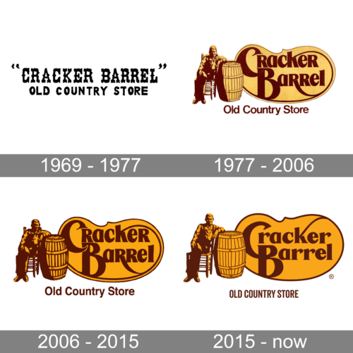
In terms of visual identity, Cracker Barrel has been following its corporate style since the middle of the 1970s, with only the very first version of the logo significantly different from all the newest.
1969 – 1977
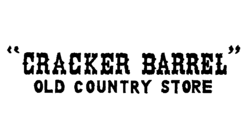
The original Cracker Barrel logo, designed in 1969, was based on just a stylized inscription in two levels, which was set in monochrome for the printing materials, and turned yellowish on the banners. The lettering was executed in a designer wishbone style typeface, resembling old Western saloons. At the bottom, “Old Country Store”, the line had a more modest, yet still stylized font, and used uppercase characters in a smaller size.
1977 – 2006
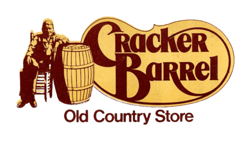
The new era of the Cracker Barrel visual identity started in the 1970s, and still lasts today, with just minor changes. The concept was built around an image of a man, sitting near the large wooden barrel, and complemented by a smooth yellow banner with warm brown lettering in two styles. The tagline of the logo was executed in a classic Helvetica font, while the main part of the wordmark — was in a custom designer typeface.
2006 – 2015
The redesign of 2006 was all about the colors, which intensified, while the contours of the graphical part and the lettering were slightly modernized and cleaned up. The badge started looking more modern and distinctive, reflecting the development of the brand.
2015 – Today
Another redesign of the logo was held by the Cracker Barrel chain in 2015. The wordmark was rewritten in a more laconic typeface, and the contours of the interior frame, which was coming out of the “K” before — got reduced, leaving more flat yellow for the background. The tagline also changed its style, getting capitalized and narrowed.
Font and color
The main part of the lettering, used in the Cracker Barrel logo, is set in a custom font, which looks quite close to such typefaces as Goldenbook Black, or Qeskile Voyage Medium, with some significant modifications. As for the tagline, here it is simpler — the uppercase inscription is executed in a narrowed sans-serif, close to Bison Bold or Uniform Pro Extra Condensed Bold.
As for the color palette of Cracker Barrel visual identity, since the 1970s, it has been based on yellow and brown, two warm shades, which evoke a sense of welcome and coziness.


