


Color in a logo is not just about aesthetics; it is a powerful communication tool that instantaneously conveys information about a brand, its values, and character. The importance of choosing the right color for a logo cannot be overstated, as it sets the first impression and can play a pivotal role in how consumers perceive the brand.
Subconsciously, each color evokes specific associations and emotions. For instance, red is associated with energy, passion, and action, while blue represents reliability, calmness, and trust. The right choice of color allows a brand to shape the desired image in the eyes of consumers and highlight its uniqueness.
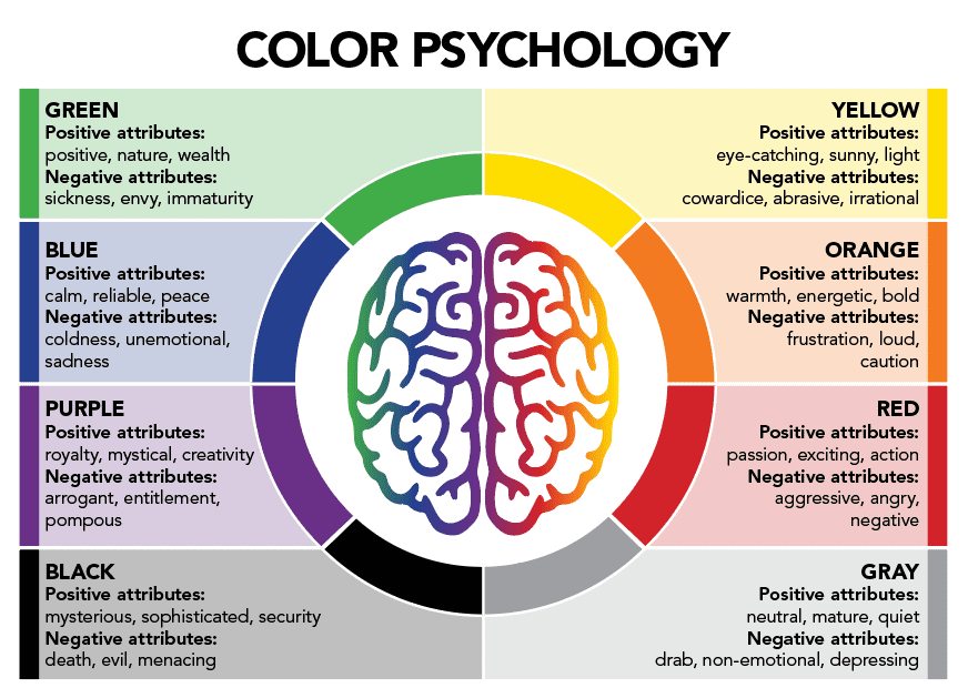
Psychology of Color
Emotional Impact of Colors
Colors possess a profound ability to evoke emotions and set a specific tone or mood. The color red, for instance, is often associated with feelings of passion, excitement, and energy. It can capture attention and create a sense of urgency. On the other hand, blue is typically linked to feelings of calmness, trust, and reliability. It is a color that promotes a peaceful and serene atmosphere.
Cultural Associations and Symbolism of Colors
Colors can carry different meanings and symbolism across various cultures. In Western cultures, white is frequently seen as a symbol of purity, innocence, and peace. In contrast, in some Eastern cultures, white can represent mourning and loss. Similarly, red is often associated with good luck and prosperity in many Asian cultures, while it can signify danger or warning in Western cultures.
Gender Perceptions of Colors
Research suggests that there may be differences in color preferences based on gender. Typically, women tend to be drawn to softer, pastel shades, while men might prefer more vibrant and bold colors. These preferences can often be seen in product branding and marketing targeted towards specific genders.
Age and Color Preferences
Age can also play a role in determining color preferences. Younger individuals often gravitate towards bright, lively colors that convey energy and excitement. In contrast, older individuals might appreciate more subdued, muted shades that evoke a sense of calm and stability. It’s essential for brands to consider the age demographic of their target audience when choosing colors for their logo and branding.
Analysis of Color in Famous Brand Logos
Examples of Successful Color Choices
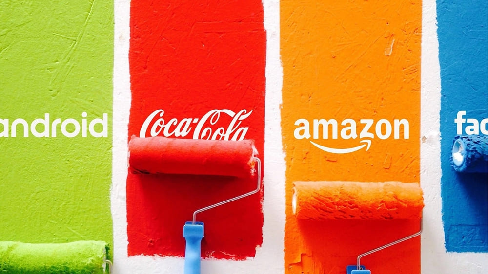
Many world-renowned brands have strategically utilized color to enhance their identity and market presence. For instance, McDonald’s famous red and yellow logo is designed to grab attention and stimulate appetite, aligning with its fast-food industry. Similarly, Facebook’s blue logo represents trust and reliability, crucial for a social media platform where users share personal information.
How Logo Colors Reflect Brand Values
The colors chosen for a logo often reflect the core values and ethos of a brand. For example, the green in Starbucks’ logo represents growth, freshness, and the company’s commitment to environmentally friendly practices. On the other hand, the black and white color scheme of Nike’s logo conveys a sense of sophistication, simplicity, and timeless elegance. By aligning logo colors with brand values, businesses can create a cohesive and authentic identity that resonates with consumers.
Choosing the Right Color for Your Logo
Defining Brand Values and Personality
The first step in choosing the right color for your logo is to define your brand’s core values and personality. What does your brand stand for? Is it modern or traditional, playful or serious, luxurious or affordable? These characteristics will guide your color choice and ensure that your logo accurately represents your brand.
Considering the Target Audience
Your target audience’s preferences and perceptions should also play a crucial role in your color choice. Different demographic groups may have different associations and reactions to certain colors. For example, younger audiences might be drawn to bright and vibrant colors, while older audiences may prefer more subdued and sophisticated shades.
Analyzing Competitors
Another essential factor to consider is your competitors’ color choices. Analyzing the logos of other brands in your industry can provide valuable insights and help you choose a color that helps you stand out from the crowd. Aim for a color that differentiates your brand from competitors while still aligning with industry norms and customer expectations.
Common Mistakes to Avoid in Logo Color Selection
![]()
Overcomplicating the Color Palette
A common mistake made by brands is using too many colors in their logo. While a diverse color palette can be visually appealing, it can also lead to a cluttered and confusing logo design. It’s essential to strike a balance and choose a color palette that is simple yet effective in conveying your brand message.
Ignoring Color Psychology and Cultural Associations
Another frequent error is neglecting the psychological impact and cultural associations of colors. As discussed earlier, colors can evoke certain emotions and have different meanings in various cultures. Brands must be mindful of these factors to avoid sending the wrong message to their audience.
Disregarding Industry Norms
Each industry has its color norms and expectations. For instance, blue is a popular color in the finance and healthcare sectors due to its association with trust and reliability. Ignoring these industry-specific color norms can make a brand seem out of place and disconnected from its market.
Inconsistent Branding
Consistency is key when it comes to branding. Once a color palette has been chosen for the logo, it should be consistently used across all branding materials and platforms. Inconsistent branding can lead to a disjointed brand identity and confuse the audience.
Tips for Choosing the Perfect Logo Color
Start with Your Brand’s Story
Think about the story you want your brand to tell. The colors you choose should reflect the narrative and essence of your brand, creating a visual story that connects with your audience.
Use Color Theory to Your Advantage
Color theory is a practical guide that explains how colors interact and how they can be combined to create aesthetically pleasing visuals. Utilize color theory to choose a harmonious color palette that complements your brand’s identity.
Consider the Emotional Impact
Remember the emotional impact that colors have. Choose a color that elicits the desired emotional response from your target audience. For example, if you want to portray your brand as eco-friendly and sustainable, green would be an appropriate choice.
Test and Gather Feedback
Once you have selected a color palette for your logo, test it across various platforms and gather feedback from your target audience. This will provide valuable insights and help you refine your color choice to ensure it resonates with your audience and effectively communicates your brand message.
Case Studies: How Logo Color Changes Affected Brand Perception
Rebranding of Instagram
When Instagram updated its logo in 2016, it shifted from its retro camera and brown color palette to a more modern, gradient color scheme. This change was a strategic move to reflect the platform’s evolution and appeal to a younger, more diverse audience. The new logo received mixed reviews, but it ultimately succeeded in modernizing the brand’s image.
Pepsi’s Color Shift
Pepsi has undergone several logo changes throughout its history, with significant shifts in its color palette. The brand has consistently used red, white, and blue, but the proportion and shade of each color have changed over time. These changes have helped Pepsi maintain a modern and fresh image while staying true to its American roots.
Google’s Use of Primary Colors
Google’s logo is a prime example of how color can be used to create a playful and approachable brand image. The use of primary colors (red, yellow, and blue) along with the simple, clean font, makes the logo memorable and reflects the brand’s innovative and user-friendly approach.


