

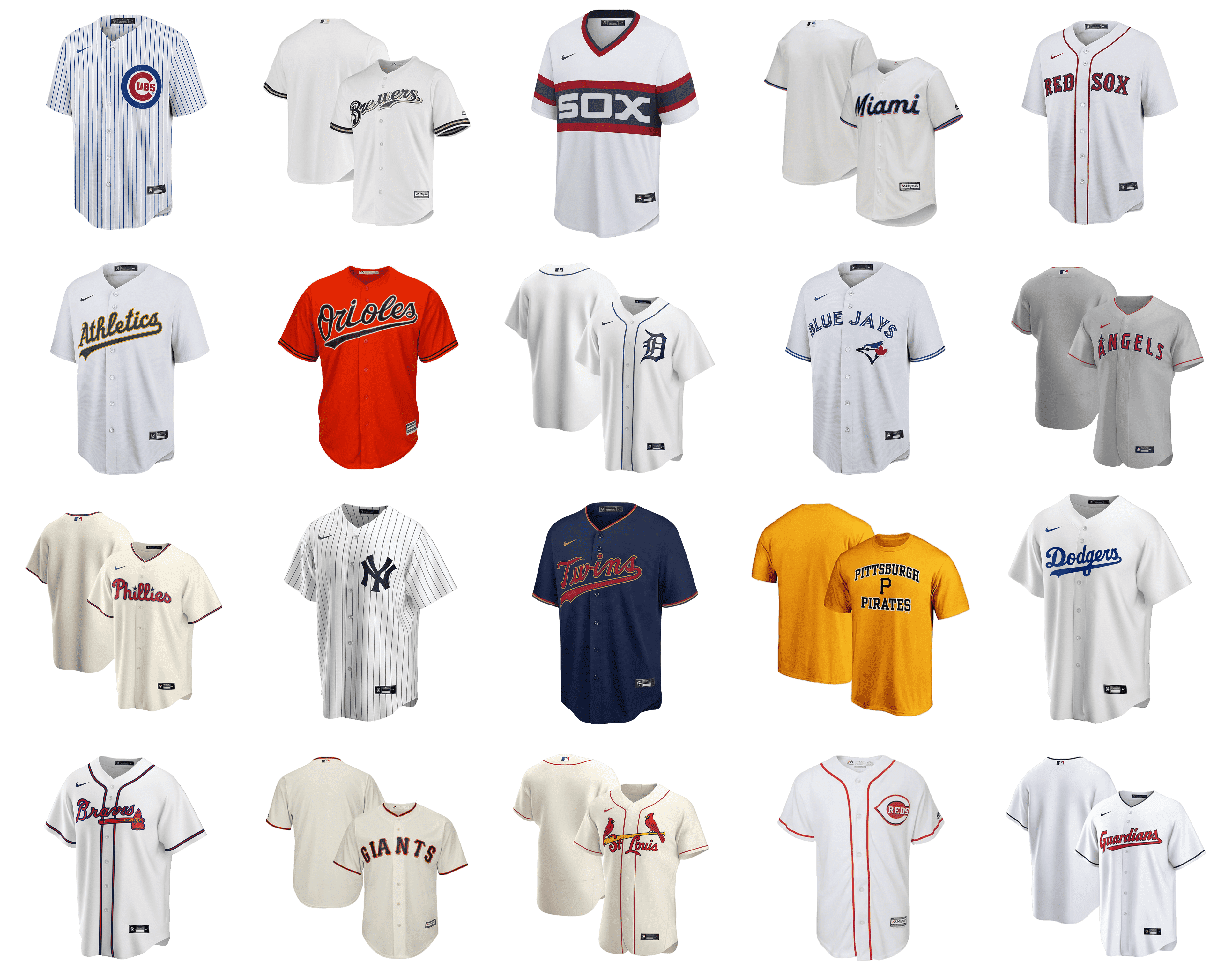
Today it’s hard to imagine a baseball game in which teams compete dressed “any way they want. After all, modern uniforms are not just a distinctive mark of the teams, but also an opportunity to show the character and values of each club.
Baseball uniforms were first worn by the Knickerbockers, a New York baseball club, in the 1800s. And they were blue wool pants, white shirts, and straw hats. Today it’s bright Jerseys, contrasting pants, and perfectly shiny helmets. And almost every piece of clothing bears the team logo.
In our review today, we’re going to look at logos and which ones look the best on MLB players’ jerseys. Below we have compiled our ranking of the best Uniform Logos.
Detroit Tigers
![]()
The baseball club from Detroit wears a very fresh and elegant white uniform with delicate navy-blue details. It is definitely the simplest and most minimalistic uniform design in our today’s list, but this is exactly what makes the sharp gothic-style dark blue letter “D” on the players’ chests look so sharp and bright. Elongated lines of the letter and their pointed tails look great with thin blue stripes vertically set on the white background.
Los Angeles Angels
![]()
Los Angeles Angels have their uniforms looking bold and powerful. Whether it’s a home set with white jerseys or the alt one with reds, the logo of the club, arched across the players’ chests is always the first thing to be noticed. It is the “Angels” inscription set in a sharp and sleek wishbone-style typeface with thick main bars and delicate pointed elements. The lettering is set in red and outlined in white and blue. The main detail of the logo is the first letter “A”, which is enlarged and boasts a small gray halo on its peak.
Miami Marlins
![]()
Miami Marlins have two different styles of uniform: the main one is with the smooth rounded “Miami” arched across the chest of the player in a custom script typeface, and the other one is the uniform we would like to put in our today’s list, with the club’s signifier, an elegant dark blue “M” with a stylized Marlin in the same palette and a double thin outline in white and red, creating a great contrast with the light blue color of the jersey.
Cincinnati Reds
![]()
Cincinnati Reds is another MLB club with white uniforms, but their white jerseys and pants do not look plain due to the bright red stripes. The thinly-striped pattern of the Reds’ jerseys is complemented by a large logo of the club, with a solid blue oval, set horizontally, and a thick red Capital “C” horizontally extended, in a white outline. The “Reds” part of the inscription was set in all capitals of a college-style serif typeface, in thin red lines and white contours. The whole badge does look very strong and distinctive.
Cleveland Guardians
![]()
The Cleveland Guardians uniform looks very modern and cool, even though it is executed in a traditional color palette, composed of white, red, and blue shades. The thing that makes this uniform stand out is the typeface of its enlarged script logotype, written across the chest. The “Guardians” inscription is set in a custom font with heavy letters written geometrically with lots of straight lines and angles. The underlining tail of the “S” also has its sides straight and looks edgy and powerful, finishing with the sharp angle pointing on the tail of the “G”.
Baltimore Orioles
![]()
The Baltimore Orioles club has very intense and bright uniforms in black and orange, with the small graphical emblem on the sleeve of a jersey, and a smooth fancy logotype written across the chest. The emblem on the sleeve depicts a stylized contoured bird in thick orange lines, the mascot of the team. As for the inscription part, it is set diagonally and executed in an elegant script typeface with all letters outlined in a contrasting shade. The font of the logotype boasts rounded shapes of the letters with the underline’s tail having its upper corner slightly cut, so not sharp as usual.
Chicago White Sox
![]()
Chicago White Sox is the baseball club with one of the most recognizable uniform designs ever. The players usually wear black or white jerseys with thin vertical stripes and a large logo set on the left part of the chest. Depending on the color of the uniform, the logo can also be whether in black or white. It is a diagonally located “Sox” in a fancy gothic style typeface with elongated lines and sharpened tails of the letters. The lettering goes from the upper left corner to the bottom right one, with the characters overlapping each other.
Milwaukee Brewers
![]()
The most interesting part of the Milwaukee Brewers’ visual identity is, of course, its graphical emblem, which is set on the helmets of the players. But the logotype, written on the jerseys across the players’ chests, also deserves attention, as is set in a strong geometric serif font, with each letter colored blue and outlined in yellow. The enlarged capital letters of the “Brewers” wordmark are set in an arch, which softens the straight bars and sharp angles of the serifs in the lettering.
Toronto Blue Jays
![]()
The uniform of the Toronto Blue Jays club has both the graphical emblem and the logotype placed on the front side of the jerseys, and both parts look really cool. The outlined inscription in blue and white has its uppercase letters set in a modern sans-serif typeface, arched across the chest, above the bright emblem, placed on the left. The emblem of the club from Toronto is a stylized image of the blue jay bird’s head in bright blue, white, and red. When set on the uniform of the players, the bird doe not have its regular baseball background.
Philadelphia Phillies
![]()
The new Phillies uniform looks really stylish and progressive, resembling a classic street style casual look. The calm blue and burgundy color palette elevates the image and is supported by the burgundy and white sleeves of the jersey. As for the logo, it is set on the left part of the chest and boasts an enlarged letter “P” executed in a stylized font with thick rounded lines. The letter is set in burgundy and has a thin white outline, and the white negative space, hits the spot, making the design of the jersey complete and sharp.
Atlanta Braves
![]()
Atlanta Braves is one of the MLB clubs, which logo makes it stand out in the list of the competitors, looking different from others. It is a bold red logotype in a classy script typeface but underlined by a graphical emblem. The emblem is a red hammer with an elongated handle and a triangular part on top, decorated by yellow ropes. This yellow accent makes the whole badge look intense and bright, while the white or black outline of the lettering adds stability and shows the traditional side of the uniform design.
San Francisco Giants
![]()
San Francisco Giants has two options for its uniform design — the one with the full lettering across the jersey, and the one with the enlarged “G” signifier on the left part of the chest. Both designs are executed in one typeface, with sharp elements all over the thick and heavy capitals. When the complete wordmark is used, it is usually set in black and outlined in orange, and when it is the signifier, the “G” gears smooth orange gradients, going lighter from top to bottom of the letter. The emblem featured a double outline in white and light-gray, which adds an elegant touch.
Pittsburg Pirates
![]()
Pittsburgh Pirates is one of the MLB clubs with three different uniform designs. Their options are arched capitalized inscription in geometric serif, fancy outlined script lettering set diagonally, or a very well recognizable signifier — letter “P” on the chest. Whatever the option is, the color palette of the club, yellow and black, makes it look sleek and bright, and with the “P” it looks very sharp and stylish, as the letter has some curves and peaks, which make it unique and interesting.
St.Louis Cardinals
![]()
The uniform logo of the St.Louis Cardinals is one of the most ornate and lively. Two red birds sitting on the sides of a yellow wooden bat, which is set above the lettering and comes through the top part of the letter “S”, if it’s “St. Louis”, or through the “C”, if it’s “Cardinals”. As for the inscription part, it is written in a very soft and elegant cursive typeface with elongated and slightly curved lines of some letters. The red color of the birds is supported by the red of the letters, and the yellow of the baseball bat creates a good contrast.
Minnesota Twins
![]()
The thing that makes the Minnesota Twins uniform so special is the custom typeface of the “Twins” logotype, written across the white jerseys of the club’s players. It is a bold title case inscription in a bold sans-serif font with the horizontal bar of the “T” slightly curved, and the angles in other letters softened, creating that sleek yet confident and modern shape. Unlike other script logotypes in the league, the Twin’s one has its underline separated from the letters. It is a pretty short line, flared to the left, and going from “W” to “N”. The whole inscription is set in a red and blue color palette, deep and intense.
Oakland Athletics
![]()
Apart from the traditional script logotype, placed diagonally on the jerseys of Oakland Athletics, the baseball club also has its uniform designed with a white or green emblem on the left side of the top. It is an elegant capital “A” in a gothic-style typeface with two sharp lines coming out of its upper part to the left, and a small capital “S” written in a modern sans-serif after the apostrophe, also on the top half of the “A”. The two completely different styles of fonts work brilliantly together on the club’s logo, especially when outlined in a contrasting shade and placed on a jersey.
Boston Red Sox
![]()
The Boston Red Sox uniform is definitely one of the most recognizable of all MLB teams, although there is nothing graphical, just the iconic red inscription in a contrasting blue outline. The lettering is set in the uppercase of a custom wishbone-style typeface with small sharp details coming out of the thick bars of all letters. When the team is playing in a gray uniform, the red lettering turns blue, and the blue outline becomes red, and in this combination, the jerseys look very chic and sophisticated.
Chicago Cubs
![]()
The logo from the uniform of the Chicago Cubs is one of the brightest and most modern in the league. Placed over the white jersey with thin vertical stripes in blue, the badge boasts a circular shape and is executed in a red, blue, and white color palette. The stylized enlarged red “C” with the smaller “UBS” inside it is set on a white roundel, enclosed into a bold blue frame, which features the cake thickness at the main letter. The “UBS” part is also set in red and is executed in a heavy and stable sans-serif font.
Los Angeles Dodgers
![]()
The visual identity of the Los Angeles Dodgers is truly brilliant, from A to Z, from the “LA” abbreviation on the helmets to the “Dodgers” or “Los Angeles” script lettering on the jerseys of the club’s players. The logotype on the uniform is written in a bold and smooth font, with every detail perfectly balanced. There are some rounded parts, balanced by slightly sharpened tails of the bars, and the thick elongated tail of the “S”, which overlaps the traditional loop of the “G”. The logo is set in a blue and white color palette, which only elevates its elegance.
New York Yankees
![]()
All three designs of the New York Yankees are impossible not to love. The iconic “NY” abbreviation with the letters overlapping each other and written in a very recognizable custom font; the thin minimalistic “New York” lettering arched across the chests of the players, in the uppercase of a super laconic sans-serif font; or the smooth cursive “Yankees” written diagonally in the upright direction. All options are executed in the team’s colors, white, blue, and gray, and look really fancy and stylish.


