

Numerous studies have long proved that color has a tremendous impact on the human brain, and if you choose a shade of your visual identity with these features in mind, the visual perception will be improved. The brand will evoke the required associations, which will lead to an expansion of the audience.
It should be remembered that there are no winning colors. But it is necessary to understand the intricacies of each color scheme to decorate the logo consciously.
![]()
Red
This color represents strength, passion, and grandeur. These perceptual characteristics will help point out the strengths of the brand. But it won’t suit every company. Scarlet-red also has a stimulating effect on the nervous system and can cause fear, irritation, aggression, and anger.
The range of associations is very wide, and it is important to understand what kind of reaction you want to achieve. For example, if your goal is to induce your audience to take decisive action, this is a great choice.
The red color on the logo suits companies associated with extreme, risk, activity. For example, this coloring can safely be used by brands involved in the organization of sports races and the production of energy drinks.
![]()
White
White is the color of openness, innocence, purity, loyalty, and freedom. This color does not cause any unpleasant associations or feelings.
Employees of medical institutions, traditionally, wear white coats. This is probably due to the property of this color to evoke a feeling of calm, trust, and purity.
White can be found in combination with other colors in the corporate identity of many companies.
![]()
Blue
Blue is clean, light, heavenly, and, at the same time, cold. Looking at this color, you think of a cloudless sky, clear water, a quiet, calm sea. It calms and soothes, makes you concentrate on the main thing.
The corporate style of blue in an advertising catalog will attract the consumer’s attention not worse than red, but it will never cause negative emotions. It is established that tired and sick people are attracted to the color blue. This explains the popularity of blue tones in the corporate identity of many companies that produce medicines and medical cosmetics.
![]()
Blue is also very often used in casino logos. Designers draw them in a restrained style dominated by blue and gray, adding white, as in the NetBet logo.
Blue evokes feelings of trust, stability, success, luck, and happiness. Blue is the color of conservatism, reliability, honesty, it can often be found in the logos of banks.
The combination of blue and white evokes associations with the sea, yacht, and fresh wind. Therefore, the blue and white tones are often found in the corporate style of companies whose activities are associated with shipping, sea trade or transportation, sale of seafood, marine travel, etc.
![]()
Yellow
Everyone associates yellow with the sun, warmth, light, joy, lightness, belief in the best. It is chosen by cheerful, impulsive, confident, and creative people. It adjusts to communication, helps to balance emotions, and to establish peace of mind.
Yellow is not often used in its purest form as a corporate color. This is because it is non-contrast and is poorly distinguishable on white paper. Therefore, it is often combined with other colors.
Yellow is often used in the corporate visual identity of automobile companies and the food industry labels, as in the Lay’s logo.
As for advertising, a combination of black and yellow always looks very advantageous. For example, the black inscription on a yellow background contributes to good perception and memorization of the text, due to a powerful contrast.
![]()
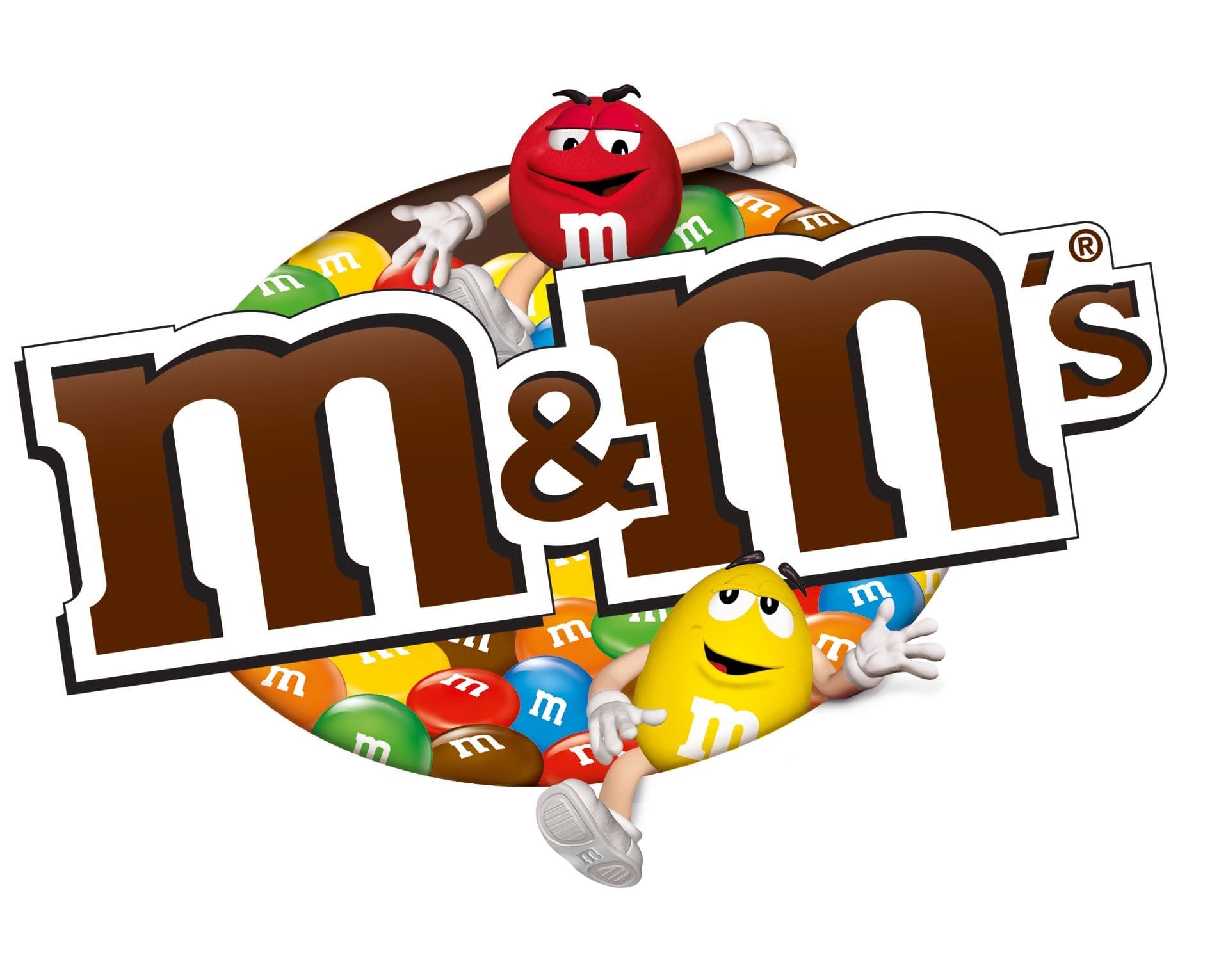
Brown
Brown evokes a sense of reliability, durability, safety, comfort, and warmth. It is chosen by self-confident people who value stability and tradition.
Brown is often seen in logos of companies, whose activity is connected with construction, agriculture, producing or selling chocolate and coffee.
Violet
The color of aristocrats and royalty, magic and spirituality. Just like red, purple is associated with power and authority, but its influence is more muted. Thus, the impact is carried out more gently and calmly.
Similar to blue, this color belongs to the cold shades. It does not cause excitement in the nervous system, does not call for active and spontaneous action. It is a symbol of wisdom, secret knowledge, respect, and confidence. Logo in purple is usually used by real estate companies and large corporations.
![]()
Pink
Pink symbolizes goodness, youth, femininity, romance, innocence, and love. It can dull feelings of aggression and anger.
Traditionally, the pink color is used in the corporate visual identity of companies whose activities are related to beauty, fashion, manufacturing, and selling products for children.
![]()
Orange
This color is the result of a mixture of red and yellow, not only in the color spectrum. The effect on the audience is also something averaged between the effects of the two main colors.
Fiery orange is softer, more comfortable, and calmer than red. This color represents home warmth, comfort, and true coziness. Because of such associations, orange coloring is often used by cafes, furniture stores, bakeries, etc.
![]()
Green
Associations with the green color are healthy living, nature, freshness, naturalness, sport, and tranquility. It encourages activity and relaxation.
Green represents balance, harmony and peace, healing and health. The moderate use of this color does not give an overabundance of emotions like yellow and is not as relaxing as blue.
If you are looking for harmony for your logo and do not want to allow the overload, feel free to choose neutral green. Especially this coloring is suitable for companies that work in the field of medicine, cosmetology, and the implementation of eco-products.
![]()
Black
You can find many logos in black and white colors for companies in various fields. In this case, most often the main color of the logo is black, and white is chosen as the background. This makes the emblem expressive.
The popularity of logos in this color is due to the peculiarities of their perception. Black, for instance, is associated with elegance, luxury, and dignified quality. Black is a color retailers such as Chanel and Nike use. And white reflects simplicity and honesty. These qualities are key at many brands choosing monochrome coloring of a logo.
![]()
Gray
Gray symbolizes reliability, calmness, safety, modesty, common sense, and intellect.
This is a neutral color. There are rarely people who love it or, on the contrary, cannot stand it. For the most part, they have a passive attitude towards gray.
Gray does not cause strong emotions, does not distract from important affairs, so business people often choose gray. It blends well with most colors, so it often can be seen in large and serious companies’ logos.
![]()


