Canada Post Corporation is a Crown corporation known as the largest postal operator in the country. The logo is the embodiment of the company’s promise – fast postal delivery.
Meaning and history
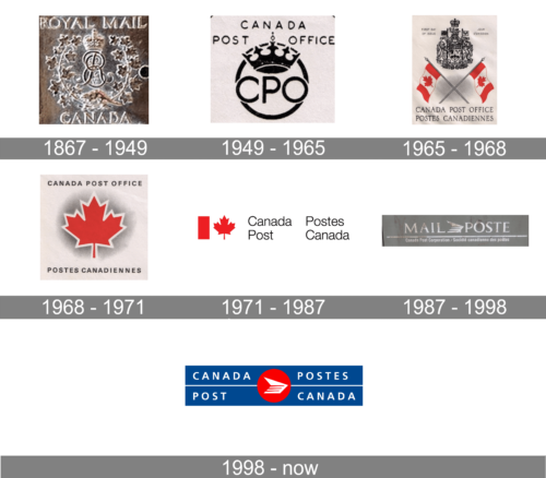
It was established in 1897 under the name of Royal Mail Canada.
The modern era in the history of the Canada Post logo started in 1987 – this is when the latest version of the emblem was introduced. It has remained virtually unchanged ever since.
1867 – 1949

The very first logo for Canada Post was introduced at the end of the 1860s and stayed with the organization for almost eighty years. It was a very traditional monogram surrounded by vignettes, with uppercase lettering above and under the image, and a fancy crown set above the central characters. The image was usually engraved on a metal plate with bronze shades.
1949 – 1965

The redesign of 1949 introduced a new badge for the new name of the organization, the Canada Post Office. The modernized badge was set in plain black lines against a white background, with the uppercase sans-serif “CPO” abbreviation in a stylish geometric font, set under the extended crown and enclosed into a circular frame. The roundel was accompanied by a two-leveled inscription in tall capitals, placed above it, and executed in the same typeface.
1965 – 1968
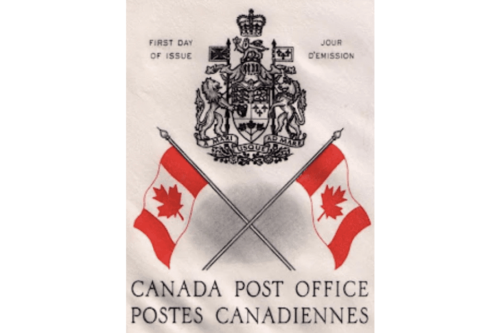
In 1965 the Canada Post Office badge was redesigned again. The enlarged coat of arms is set in thin black contours placed above two crossed flags of Canada in red and white and accompanied by the two-leveled lettering in a medium-weight serif font with very elegant capital characters. The bottom inscription was supported by the “First Day of Issue” wordmark set in English on the left of the crest, and in French — on its right.
1968 – 1971
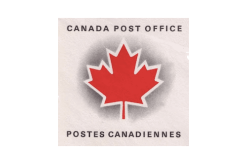
The redesign of 1968 created a simpler and stronger logo for the Canada Post Office. It was a white square with an enlarged red maple leaf, outlined in white and shadowed in gray, set in the center, and accompanied by the English name of the organization written above the emblem, and the French name — under it. Both inscriptions were set in the uppercase of a modern and stable sans-serif font. This badge was only used by the Canada Post Office for three years.
1971 – 1987

In 1971 the logo of the Canada Post Office has refined again, and it happened after the name of the organization was shortened to Canada Post. The new badge featured a horizontally-oriented rectangle, with the flag of Canada on the left accompanied by two leveled lettering in English, set in a lightweight sans-serif. The inscription was followed by the name of the agency in French and finished with one more Canadian national flag.
1987 – 1998

At the end of the 1980s, the badge of Canada Post changed again. It was a string badge in a gray color palette with heavy serif lettering underlined by the complete name of the agency, separated from it by a thick horizontal line. The two parts of the main wordmark were separated by a stylized geometric emblem, resembling an abstract bird, or a plane.
1998 – Today

The centerpiece of the design is the symbol representing a winged envelope. You can see a white parallelepiped, which stands for the envelope, and a white triangle, which stands for the wing. The red stripes seen on the envelope reinforce the impression of motion implied by the “wing.” The white symbol is placed inside a red circle, which adds an eye-catching nuance.
The circle, in its turn, is placed inside a dark blue rectangle standing on its wider part. To the left of the circle, the lettering “Canada Post” can be seen, while the text to the right reads “Postes Canada” (which is the French version). The type is a simple sans. It looks very light and clear. While the light weight does not make it better legible, it goes well with the “airmail” idea suggested by the wings.
A white bar breaks the blue rectangle into two parts. It looks like the route the winged envelope needs to follow. As a result, this element supports the motion theme already present in the design.
The Canada Post logo was developed by Paul Arthur & Associates in 1987. Paul Arthur (1925-2001) was a Canadian graphic designer known for coining the terms “signage” and “wayfinding.”
Colors
The company’s official brand identity guidelines do not approve of using any colors in the emblem other than PMS 280 and PMS 485 or their CMYK equivalent (as of late 2020).


