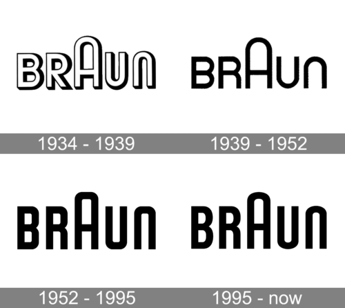
The visual core of the Braun logo has remained virtually untouched since 1934. The emblem has always been based on a wordmark featuring a rounded type with a prominent “A.”
Meaning and history

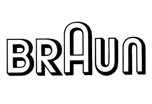
The original emblem, which was created by Will Münch, featured the name of the brand given in white letters with black borders and shades. The “A” was taller than all the other letters adding a sense of rhythm to the design.
1934 – 1939

The original emblem, which was created by Will Münch, featured the name of the brand given in white letters with black borders and shades. The “A” was taller than all the other letters adding a sense of rhythm to the design.
1939 – 1952

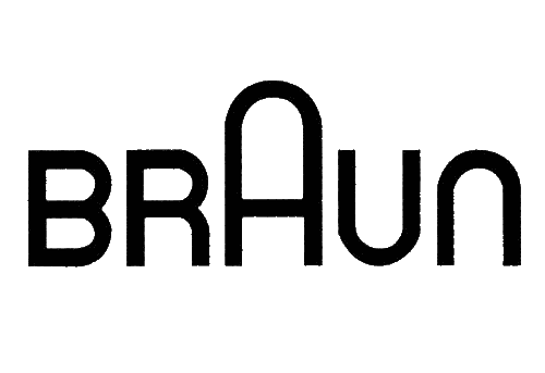
The wordmark grew more minimalist due to the disappearance of the black shades and borders. The letters became solid black. They are lighter than in the previous logo, yet better legible.
1952 – 1995
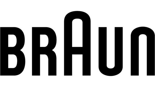
Having joined the company in 1952 as a freelancer, Wolfgang Schmittel updated the Braun logo. He made it simpler and lighter. The original emblem was based on the following relationship between the thickness of the bars and space: 1:1.3 for the “A,” 1:1 for all the other letters. In Schmittel’s wordmark, the white gaps were much wider, so the lettering seemed to have more breathing space.
The proportions were updated once again several years later, due to which the logo became bolder and more eye-catching. However, the overall style, including the rounded parts of the letters and the enlarged “A,” remained unchanged.
1995 – Today
The difference between the 1952 version and this logo is almost unnoticeable. However, an attentive eye will notice that the letters became more rounded. The new typeface was very similar to the Plastik Regular font. It is not clear why the company made this change, but it is likely simply wanted to attract attention while preserving the recognizable brand image.
Colors
The company has always been loyal to the original black-and-white color scheme, from the earliest logo developed more than 80 years ago, to the current one.


