 Bowling Green Falcons Logo PNG
Bowling Green Falcons is the name of an athletic program from Bowling Green State University, which was established in 1910, and is based in Toledo, Ohio. The program is composed of 17 sports teams, which all play in the first division of the National Collegiate Athletic Association.
Meaning and history
As a part of Division I of NCAA, the Bowling Green Falcons teams are also members of several sports conferences. Thus, almost all of the clubs attend the Mid-American Conference, an intercollegiate organization, established in 1946 and composed of 12 collegiate athletic programs, while the men’s ice hockey team is a member of the Central Collegiate Hockey Association, founded in 1971, and has 8 teams competing. The football team of the program from Ohio is pretty strong and competes in the Football Bowl Subdivision of the NCAA.
What is Bowling Green Falcons?
Bowling Green Falcons is the collegiate athletic program of Bowling Green State University, which consists of seven men’s and ten women’s teams, competing in various sports disciplines, including Cross Country, Basketball, Baseball, indoor and outdoor Track and Field, and several others.
As for the visual identity, Bowling Green Falcons were not lucky to find their perfect logo from the first attempt so there have been several redesigns of the program’s badge, till they finally found a unique style and color palette, which suit their values, reflect their mood and make the emblem memorable and recognizable.
1966 — 1979
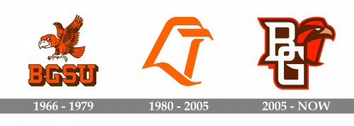
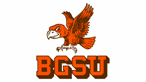
The Bowling Green Falcons logo, designed in 1966, was composed of a funny caricature of a bird, flying to the left above the massive square “BGSU” abbreviation set in all capitals of a geometric serif font. The whole badge was executed in a dark orange and brown color palette and was lacking contrast in and between the elements. Although, the enlarged beak of the bird was set in white, as well as the paws, which were also drawn in a non-standard size.
1980 — 2005
The redesign of 1980 introduced a super minimalistic badge for the athletic program of Bowling Green State University. It was an abstract contoured image of a bird’s head, drawn in three thick lines with curved and pointed ends. The bird had no details, no eyes or feathers, and it was the only element of the badge, without any lettering added to the composition.
2006 — Today
In 2006 the logo of Bowling Green Falcons gets another redesign. The new badge is executed in a red and brown color palette, but with an addition of white, and a small golden beak of the bird, which is now set on the right from the abbreviation. The bird is drawn in a modern geometric way but still looks much more realistic than the one from the previous version of the logo. As for the lettering, it is a vertically set uppercase “BG”, with the letters intertwined and the “G” slightly shifted to the right. Both letters are written in a bold and elegant serif typeface with some sharpened details resembling feathers. The lettering and the graphical elements are outlined in brown and red.


