While the Boca Raton Bowl logo is not very unique, its joyful holiday mood places it among the logos that are pleasant to look at. How has the design team achieved this effect?
Meaning and history
What is Boca Raton Bowl?
Boca Raton Bowl is one of the NCAA college football bowls, which was established in 2014. The Bowl is located in Boca Raton, Florida, and its games are played on the FAU Stadium.
2014
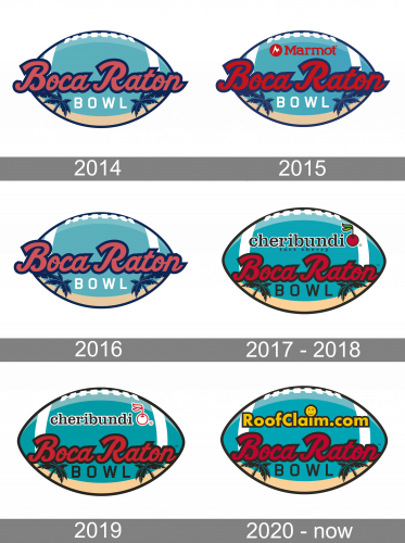
The Boca Raton Bow logo from 2014 featured a bright turquoise horizontally oriented rugby ball as the body of the emblem. The bright pink cursive lettering in a bold dark blue outline was written over the ball, slightly coming out of its borders in the beginning and the end of the inscription. The white geometric “Bowl” was set under the pink “Boca Raton”, underlined by a thin sand arch with blue palms on the sides. It was a lively and very memorable badge, which was used by the league for only one season.
2015
With the redesign of 2015 the pink lettering was changed to the red one, with the contours of all letters slightly extended. The upper part of the turquoise badge now contained a solid red logotype of the new sponsor, Marmot. It was written in the corporate serif typeface and complemented by the emblem on the left. The Marmot emblem is a solid red circle with a sharp stylized as the mountain peaks letter “M” in white.
2016
The sponsor logotype was removed from the logo again for the season of 2017, and the Boca Raton badge, designed in 2014 was brought back. The only difference was in size — all elements of the logo got enlarged, thus the whole image started looking more powerful and confident despite its tender and even feminine color palette.
2017 – 2018
To begin with, we should mention the choice of colors. The transparent teal with white nuances brings to mind the images of transparent water and warm lagoons. The two palms may be a totally generic choice, yet it is a good way to make the “tropic” theme as apparent as possible. We should also take into consideration the selection of the typeface, which only reinforces the holiday island feel. The design is placed inside a football, which reminds of the fact that the logo belongs to a football bowl.
2019
The Cheribundi logo on the Boca Raton Bowl badge was simplified in 2019, and that made the badge lighter and more modern. The red cherry on the sponsor’s emblem was redrawn in white, while its black outline was switched to the red one. Now it looked more balanced, placed close to the white stitches and lines of the stylized rugby ball. As for the other elements, they all remained untouched.
2020 – Today
In 2020 the Boca Raton Bowl gets a new sponsor, and now it is RoofClaim.Com. The logotype of the sponsor was set on top of the emblem, where the Cheribundi insignia was placed on the previous version. The new inscription is set in bold yellow letters with a black outline and had the dot above the “I” stylized as an enlarged circular emoji. Although all other elements of the logo kept their original style and shape, the red color of the “Boca Raton” wordmark got deeper and darker.


