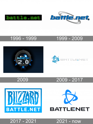
Battle.Net is an online platform for gamers, which was created in 1996 by Blizzard. The platform was also launched in iOS and Android application and is considered to be one of the most visited gaming websites.
Meaning and history
Battle.net is an online digital distribution and social gaming service developed by Blizzard Entertainment. Battle.net was launched on November 30, 1996, to coincide with the release of the role-playing game Diablo.
Battle.net was the first online gaming platform built right into the games in which it was used.
The successful launch of Battle.net prompted other companies to start developing their online platforms, borrowing many of the features and interfaces.
On March 20, 2009, Blizzard officially announced an updated Battle.net 2.0. Details were announced at Blizzcon 2009, where it announced support for such games as StarCraft II, Diablo III, and World of Warcraft. The original Battle.net was renamed Battle.net Classic.
What is Battle.Net?
Battle.Net is a service for launching Blizzard games, getting free trials, buying games from the online store, and a social platform.There is a browser-based version, which is limited to the online store proper, as well as a mobile app and a PC program.
1996 – 1999
The very first logo for the Battle Net service was introduced in 1996 and stayed active for a bit less than three years. It was a lowercase inscription in a stylized green font with thin black horizontal stripes, placed on a solid black background. It was a pretty dark and dramatic logo, which brilliantly reflected the purpose of the platform.
1999 – 2009

The original Battle Net logo was designed in 1996 and stayed with the company for over a decade. It was a bold lowercase inscription in a modern slanted sans/serif typeface with bold lines and massive shapes on the blue letters, outlined in black. The inscription featured a pixel structure and was decorated by a diagonally oriented orbit on its background, executed in a gradient silver color palette. The orbit image was accompanied by the diagonally stretched silver dot between the two parts of the domain name in the logo.
2009
The redesign of 2009 refined the contours of the previous version, brightened up its color palette, making it gradient and even neon, and placed it inside a more complicated composition; with the circular framing made up of a thick wreath in dark silver, and decorated by several snow peaks of different lengths, set mostly along the bottom part of the frame. The whole badge was placed on a deep and dark blue background, which was evoking a sense of mystery.
2009 – 2017
 The original Battle.Net logo features an abstract swirl-like image composed of several intertwined curved lines. Executed in two shades of blue, it was instantly recognizable all over the globe.
2017 – 2021
The 2017 Battle.Net logo keeps the original color palette and the overall mood, but nothing else from the old version remains. The logo is composed of a bright blue rectangular frame with its bottom side thickened.
The “Blizzard” lettering is placed inside the frame repeating its color. It is executed in the brand’s iconic typeface, with pointed angles of elongated letter-lines and uneven edges.
The Battle.Net inscription in all capitals is placed on the lower bar of the frame. It is written in a traditional neat sans-serif typeface and featured a dark blue shade, as the logo’s background.
The Battle.Net logo evokes a sense of mystery and creativity. Its color palette gives a lot of space for imagination and represents a confident and powerful company.
2021 – Today
In 2021 the Battle Net badge got redesigned again, with the concept of the badge changed dramatically. The new logo of the service features a combination of modern black lettering in the uppercase of a stylish progressive sans-serif font, and a blue emblem made up of three orbits with sharpened ends. The color of the emblem is supported by a small solid blue dot, placed between the two parts of the wordmark.
Font and color
The heavy uppercase lettering from the logo of the Battle.Net platform is set in a futuristic sans-serif font with the stable characters horizontally extended and the ends of the vertical bars of the “T”s cut diagonally. The closest fonts to the one, used in this insignia, are, probably, Conthrax Bold, or Nulshock Regular, but with some significant modifications.
As for the color palette of the Battle.Net visual identity, it is based on a combination of black and blue, which looks clean, stable, and confident, reflecting such qualities as professionalism, reliability, and progressiveness.


